Screen vs Digital: A Printing Conundrum That’s Good to Have
Screen vs. Digital
For anyone who’s been working in the print industry for some time, it would be easy for them to tell the difference between a screen-printed sign and a digitally printed one. If you’re new to the industry or if you just want a better understanding of what these differences are, then you’ve come to the right place. Instead of asking yourself which method is better, you should be asking which is better for the way you plan on promoting your signs. What you need your signs for, will help determine which option is better for you. As we jump into the different techniques, we will discover the pros and cons of each method and highlight which attributes make them worthy competitors in the industry. For this particular comparison, we’re going to assume the same material (corrugated plastic) was used for both formats.
Screen

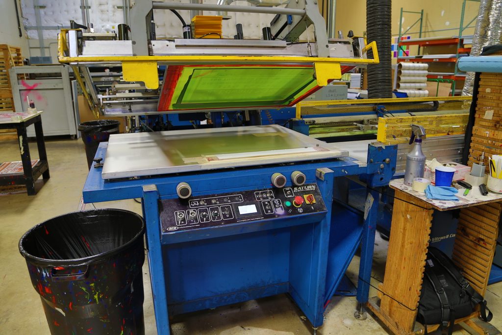
Screen printing has been around for a very long time. It has proven to be one of the most reliable ways to get the job done and at a decent price. This technique requires a fine mesh screen that gets coated with a chemical known as an emulsion. Once dried, a stencil can then be made to print with. It then gets placed into a machine or some form of printing table where ink is added and the print can begin. The image then gets transferred to the correx, (the material commonly used for yard signs) with the swipe of a squeegee that has a good amount of pressure on it. After printing is complete, it goes under a UV light to cure the wet ink, and boom, you got yourself a sign.
Most screen-printed signs are printed with a standard color selection of UV inks, so they can be cured quickly, and they will last longer against outdoor elements. Because of that feature, they are most commonly used outside. The ink used in screen-printing also has more of a gloss finish when completed. A big reason why people use screen printing is that higher quantities can be printed at a lower cost. One downside to printing in this manner is that full-color signs cannot be done. That means you can only print with a maximum of 4 colors in one design. However, most print shops that do screen-printing limit it to 3 colors. On average, signs done with this style tend to last about 3 – 5 years, enduring the weather that all the seasons have to offer.
Digital

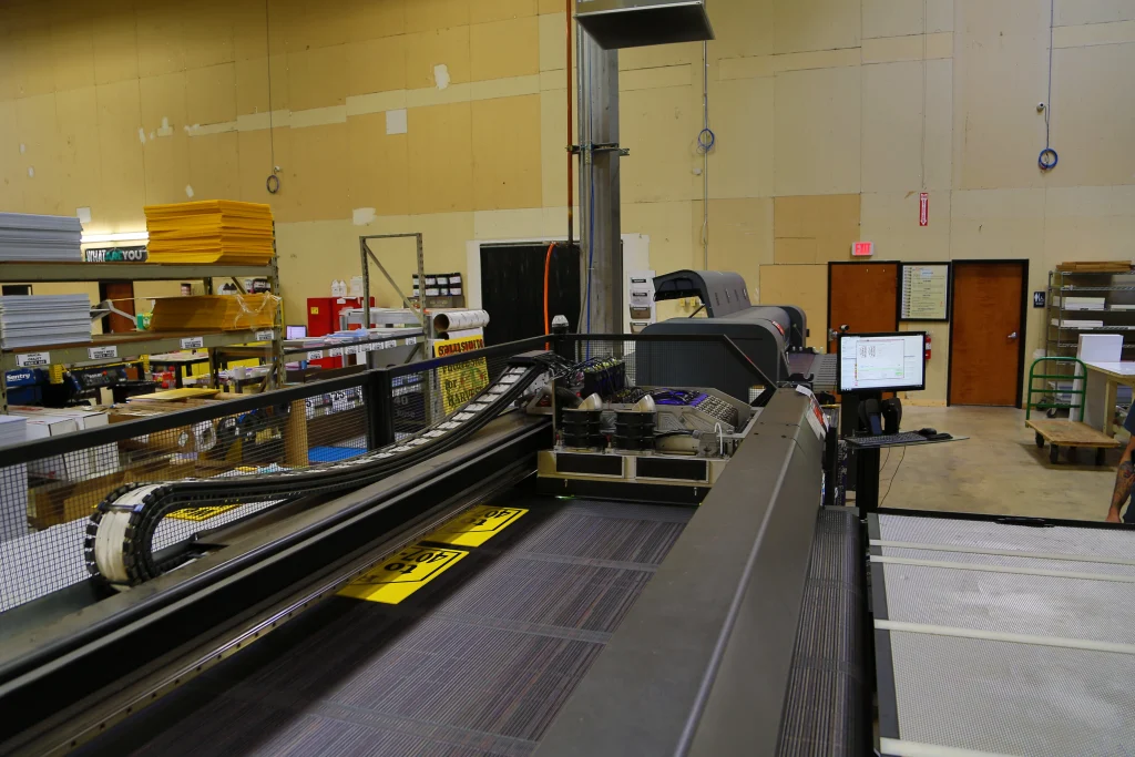
In the other corner, we have digitally printed signs. Digital-printing presses have become more popular lately and are commonly used for their faster turnaround times and the ability to modify an image. These signs are printed in the way the name implies, digitally, meaning a big printer that usually uses Inkjet or Laser printing to lay down a design onto the sign. It’s like a desktop printer, just on a larger scale. An image is loaded into the machine’s queue, along with the desired material, and then the print can begin. As it prints, a giant print head moves back and forth, putting down the image one band at a time, also curing the ink being used at the same time. Once finished, the sign comes out ready to use; no extra drying time needed.
Digitally printed signs are used more in an indoor setting rather than outdoor. Although the ink used is also UV ink, it’s only rated for 2 – 3 years of prolonged outdoor exposure. On the plus side, digital printing can allow full-color signs along with full bleed. Full bleed means the image goes to all edges of the sign. In screen printing, a 1/3 of an inch blank border is left on the sign. Due to these benefits, digitally printed signs are more expensive per unit than screen-printed ones.
Conclusion
Depending on your needs for signage and where you plan on having your business or campaign signs placed will be the biggest determining factor when it comes to choosing which of these methods is the best fit for you. If you have a simple design, that you need a lot of copies of, and want to put them around the neighborhood, then screen-printed signs are the way to go. On the other hand, if you need just five duplicates of an intricate layout, we would recommend the digital option for that. Let’s say you have a full-color design and need a high quantity. You’re going to land at a middle price point but might have to pay just a little extra for your signage. The same goes for a small quantity with a simple design. Since it takes more resources to make a screen-printed sign than it would for a digitally-printed one, it’s more cost-effective for any customer to go digital for an order like that. This should help give you a better understanding of the two formats and aid you in your purchasing decision.
If you have any further questions or are still apprehensive of which way to go, feel free to contact our customer service specialists who are ready to help.

