Matt Medel

Seven Business Card Designs of the Future

Nearly every modern business utilizes business cards to promote themselves, yet they are often tossed in the trash by their recipients by the end of the week. While business cards continue as a staple in the business world (and it’s nice to have one available when a client asks), businesses need to adapt their cards to fit ever-shifting trends and stand out amongst the competition. Otherwise, the expense and hassle of creating a business card is a total waste. 


What inspires a client to keep your card in their wallet rather than toss it when they get home? For one, your business card must be eye-catching. You can achieve this through fonts, brand-colors, phrases, imagery, or even the shape of the card itself. Of course, the most important goal of a business card is to convey useful information to the client, such as name, email, website, and professional social media pages. If you aren’t sure where to begin in your business card design brainstorming session, take a look at the top seven on-trend business card designs of the future below to spark an idea or two.


Minimalistic

A business should convey some information on their business card, but overstuffing and overwhelming a card can be overkill. A customer doesn’t need to know details about specific products or services on a business card. They do need to know your website to find that information, however. Keep it short, sweet, and simple when it comes to how many lines of text you decide to include on your cards.


Along with the amount of words on the card, minimalistic amounts of color, fonts, and images are also on-trend right now. A single-color background with just the business name or logo on the front can help a card look clean, fresh, and professional. You can play around with foiled lettering or different textures to make it unique and un-boring. The important business information can be listed on the back without cluttering up the simple and bold advertisement on the front.


Transparent

Another interesting design idea that has been recently floating around is that of transparent business cards. A specific brand color or pattern can be applied to the transparent paper, but the uniqueness of the see-through design can help it stand out amongst competitors. Of course, transparent cards don’t work with every type of business, especially since transparency conveys a certain message. For instance, a data privacy company may not want see-through associated with its name. However, it may fit the theme of a window company. The takeaway is that businesses are no longer limited to traditional cardstock for business card backgrounds, and they can experiment with different types of material.


Out-of-the-Rectangle

Businesses are no longer limited to the traditional rectangle shape for business cards either. To stand out, some businesses are experimenting with different shapes and sizes for their business cards. Of course, business cards should still serve the practical purpose of storing until future need and easily fit inside a wallet or card carrier. 


Interactive

Depending on the type of business, interactive cards can be a fun way to hold the attention of a client or future client. Cards that fold into different objects or have hidden pull-and-slide messages are unique and fun for clients to fidget with when they are familiarizing themselves with your contact information. If anything, these types of cards will definitely be remembered for their distinctive designs.


Social

Just like other types of marketing, business cards should display professional social media accounts as a way for customers to connect with a business. Even if they don’t use the services or products right away, they may want to connect digitally before tossing a card. If a business spends a lot of time marketing and/or selling on social media, this is essential information to include.


Humorous

Humor is a universal language, and it can stand out and intrigue just as much as a color scheme, font, or design. Humor, puns, and sarcasm especially resonate with younger target audiences. Whether it’s through clever imagery or a play on words, many businesses are now incorporating humor into their business card designs to help make a lasting impression with their clients.


Multi-Purpose

A business card can serve two or more functions if you get creative. Instead of handing out multiple cards for different purposes to potential clients, why not just hand them one? If you offer 10% off to new clients, you can include this deal on the card. Or, if there’s a page on your website specifically created for potential clients, you can put this URL on the card in place of the standard homepage. You can even turn a business card into a “frequent customer” card and offer a free product or service for every 10 punches on the back. Businesses are consolidating some of this information onto one card that increases the chances that a customer will keep it longer than a day or a week.

Five Unique Real Estate Open House Signs

Table of Contents

When it comes to real estate, signs are everything! Well, nearly everything. A real estate sign like bandit signs can attract passersby to stop and check out the new listing or they can help potential buyers find the right property when arriving for a viewing. Real estate signs are often the first detail buyers notice when looking for homes. Because of this, real estate and open house signs need to convey a clear, clean, and informative message. A tattered or cheap looking sign may warn buyers to stay away, while an elegant and clean sign can be inviting to a potential buyer. 

Open house signs are different than traditional “For Sale” signs in how they market the home and attract potential buyers. However, they can also pair well with “For Sale” and other signs for maximum impact. If you need an open house sign that stands out in the neighborhood, take a look at the top six unique sign ideas below.

1.Use Separate Signs.

For the most part, the “For Sale” yard signs stays near the front door or in the front yard of a home for sale from the time it is listed to when the buyer takes ownership. An “Open House” sign may only go up the morning of the open house and taken down that afternoon. Since open house signs are not permanent fixtures, there is more flexibility in how and where they are displayed. It can be as small as a sign rider that is attached to the for sale sign, or as large as a big campaign sign visible from a block away. Whatever type of marketing is used for the open house, the sign should be separate or stand out from the permanent for sale sign.

2.Consider the Color Scheme

When using separate signs, it can be a good idea to create cohesion with the same color scheme. Usually, the color scheme on real estate signs matches the color of the real estate company. However, one color could be highlighted over another depending on the area or neighborhood. Understated signs may be best for high-end neighborhoods, while bold signs will help a sign stand out in more affordable neighborhoods, especially if the market is saturated in that area. A unique color scheme is also more easily spotted over traditional real estate color schemes.

3.One Size Does Not Fit All

Potential buyers are so accustomed to seeing real estate signs.  One sign begins to look like every other sign until they can’t tell the difference.  Make sure your sign stands out by altering the size of the signs that are placed on multiple properties.  Real Estate signs come in a variety of sizes, from 9×12, 18×24 (standard size), to 24×32. Catch a buyers attention by diversifying your sign size. 

4.Pair the Post with the Place

Signs would be relatively useless without a way to display them. However, not all sign posts are created equal. Standard wire stakes may work for most open house signs in most places. Although, a steel sign frame can add a touch of class, while a promotional a-frame sign is free to place on the sidewalk or the street. The layout of the street and the set-up of the entryway may dictate what type of sign display method is best. The type of sign post used can also influence what information and how much is used on an open house signs. The more room you have to work with, the more creative you can get!

5.When in Doubt, Add More Signs

A single open house sign may be missed, ignored, or completely hidden from a majority of the traffic in the area depending on the location of the home. To overcome this hurdle, a unique solution some real estate agents are using is simply adding more signs around the neighborhood. Directional signs at the main entrance of the neighborhood not only help potential buyers find the home they saw online, but it can attract extra traffic passing by on the main road. More signs in the front yard can also signal that an open house should not be missed. You can always add a bit of distinctive charm by including balloons or other eye-catching items so that the home buyers won’t quickly forget.

Digital Printing Services Made Easy

Table of Contents

Digital printing is an increasingly popular production method that involves making prints from electronic files. Essentially, it takes artwork from a computer (i.e., from a fundamentally digital format) and prints it onto a range of available materials. In contrast to traditional analog printing—which includes gravure and flexography—digital printing has some distinct advantages in today’s modern technological landscape.

In a nutshell, digital printing eliminates a significant portion of the manual steps that are inherent to analog printing, including manual stripping, the construction of color and film proofs, along with making a stencil or plates as well. So if you are thinking about going the digital route for your next promotional printing endeavor, here are some things you should know.

How Digital Printing Works

Here’s how digital printing works. First, a formatted image is sent to a printer. These files are typically in EPS or AI formats. Keep in mind that digital printing works best with highly detailed images. In contrast to analog printing, digital printing instantly transfers the digital image to a printed one, there is usually no formatting required whatsoever. Additionally, you can forget about using things like photo chemicals or film plates. Yes, it really is that easy.

Digital production typically follows these key phases:

  • First, the person overseeing the process must make sure the file meets the resolution and size requirements to ensure it comes out looking as sharp and crisp as possible.
  • Next, any bleed is trimmed and crop marks are added wherever is necessary, if at all. Crop marks are the lines occupying the corner of the print. Their purpose is to ensure that unprinted edges are not present in the final print.
  • Once crop marks and bleed are added, it is time to ensure that the image occupies as much of the material as possible. Known as an imposition, this stage ensures that the job is completed as efficiently as possible with little waste.
  • The final stage is conversion. This is where you will need to make sure the image or text is converted into an appropriate file format—such as AI or EPS. You could also print a PDF file, though this is entirely dependent on the software you use.

Digital Printing Is the New Baseline

Digital printing is a relatively modern development. As such, it is equipped with many conveniences that are not available with analog printing. Now more than ever, clients expect their prints to be as accurate as possible. As such, the printers used need to be able to accomplish high-quality printing in an expedient time frame. Unfortunately, it can be somewhat difficult to zero in on what process is best for the specific job you are working on. So before you finalize your design decisions, there are a few considerations that will make your life easier.

The Up Sides of Digital Printing

The most noticeable aspect of digital printing is quality. If digital prints signify anything in and of themselves, it is quality and consistency. This means that colors print perfectly and there are no splotches or obtrusive lines. The entire process is so cohesive that the very last print should bear the same impeccable quality as the first.

Another convenience afforded by digital printing is timeliness. As a whole, the process entails far fewer steps than traditional analog printing, which means turnaround times are much quicker. Additionally, digital printing does not require printing plates, which makes setting up jobs much quicker and more cost effective.

If your project involves short to medium print runs, digital printing is most definitely the way to go. In addition to being more reliable than analog printing, it is also one of the more affordable printing solutions.

Additional Advantages: Variable Printing

In addition to expedient turnaround times and exemplary quality, digital printing also allows for complete customization. So if you need to reach a diverse audience, digital printing is definitely something you should consider. It will enable you to tailor each piece to a specific customer, which is simply not possible with analog printing.

Known as variable data printing (VDP), this convenient form of digital printing allows for certain elements to be altered without stopping the design process. These elements include images, color, names, and the headline. When used in tandem with the right technology, high-quality results can be produced very quickly. This is particularly advantageous for direct mail pieces.

VDP And Personalization

VDP is subject to three different levels of personalization. The first and most basic pertains to the recipient’s name and address. Essentially, the name and address can be altered in accordance with the intended recipient of each item, which makes the entire process that much faster and saves the recipient’s time and yours.

There are a variety of ways to push personalization even further. The most useful involves the personalization of transactional information, which pertains to specific dollar amounts, charts that reflect specific information, and graphics and numbers that can really capture a prospective client’s interest.

The final and arguably most useful aspect of VDP is image personalization. Any seasoned marketing expert or psychoanalyst can tell you that images help the brain retain information much more efficiently than other mediums. Consequently, personalizing images for each recipient based on psychographics or other gleaned information gives you a much better chance of forming a genuine connection that could lead to increased sales down the line.

Digital Printing and Accuracy

One of the most convenient aspects of digital printing is its razor-sharp precision. It is relatively easy to print samples to check the accuracy of various elements, such as color, to ensure your print matches exactly what you are picturing in your mind. To that extent, altering font sizes, image properties, as well as colors and their associated properties is synch. Again, this level of precision and convenience is not possible with analog printing.

Digital Printing Has Environmental Benefits

As you could probably guess, digital printing is environmentally friendly. For one, it reduces waste and prevents further pollution. Although it still necessitates the use of paper and related materials, it uses much less than other approaches. This is because digital printers and associated equipment do not need to be set up in the same manner. Further, digital printers place ink using electronic charges, which significantly reduces waste.

Another convenient and environmentally friendly aspect of digital printing is the ability to send and approve prints electronically. Before digital printing, pressing proofs required significant setup time, including preparing the plates, stringing the paper, printing it, then cutting it. Fortunately, technology has made the entire process much quicker and more efficient. There are a wide array of programs that will give you a good idea of what your image will look like before you print anything. However, there will still be times when you will need to proof your images. For example, spot colors, unique finishes, or different materials should be proofed to ensure they appear exactly how you envisioned.

Compared to traditional printing, digital printing uses far less toxic chemicals. While it still needs to make use of solvents to remove its oil-based ink, it does not use anywhere near the amount required for analog printers. Overall, this results in a positive environmental impact while giving you cost-effective, high-quality images that are sure to capture the attention of your target audience.

Digital Printing and Graphic Design

Digital printing is capable of producing vibrant and detailed images. Therefore, if you are using custom images you will need to ensure that they are appropriately designed and detailed. Do not fret if graphic design is not your forte, there are plenty of efficient designers out there that are likely more than happy to assist with your project. Our experienced designers provide proof changes up to 3x without charging prior to production? They can also re-create certain files like text and vector artwork for as little as $30 or up to $90. *Not applicable to detailed illustrations or photos.

When searching for a designer, try to find someone who specializes in what you are looking for. Once you zero in on one, be sure to communicate with them as thoroughly as possible so nothing gets convoluted in the process. Unfortunately, this is an area that can end up costing you more money if you are not careful.

Selecting the Right Colors for Your Digital Prints

Adding color to your digital prints is absolutely worth it. Materials printed in full color tend to achieve a much higher response rate than their back and white counterparts. This is likely because vibrant colors subtly communicate a sense of professionalism and commitment, which is something that will make customers feel at ease when doing business with you.

When it comes to digital colors themselves, you should be aware that they are known for their crispness, beauty, and generally engaging qualities. Needless to say, this combination puts them heads and shoulders above other forms of color printing. So if you are in the process of selecting a company to handle your digital printing needs, Super Cheap Signs deserves your attention. In addition to their high-quality printers and vibrant inks, their team of printing experts will assist you every step of the way with any questions or concerns you may have.

Custom Posters for Cheap

Table of Contents

When it comes to reaching an audience, posters are one of the most fruitful and surefire means of capturing someone’s attention. All you need to make a powerful visual impression is a tactful design and clean layout that is memorable but does not cost a fortune. No matter what your business objectives, custom posters are an effective means of promoting your cause while simultaneously imparting a little aesthetic flair. If that idea sounds enticing, here are some more reasons why economically priced custom posters are a must.

Posters Are Cost Effective

Whether your goal is to market a business or decorate your home, posters are extremely cost-effective. Compared to print ads, posters will save you a lot of money and, in the case of marketing your business, could potentially result in more exposure.

Compared to print ads, posters are a decidedly more economic solution. Typical print ads can range anywhere from $500 to over $15,000, which is much more expensive than an ostentatiously large poster with high-quality graphics. On top of that, keep in mind that a print ad will restrict your audience to those who read or subscribe to those particular publications. On the other hand, a cleverly placed poster will incur no such restrictions.

First Impressions Are Everything

While posters are certainly convenient for your budget, they are also an excellent means of generating positive first impressions from prospective customers. This is why high-quality materials and extensive color options are so important. Fortunately, quality is easy to find at Super Cheap Signs. In addition to providing photo-quality, large format printing, they offer the option to customize your entire poster. You can even upload custom designs for inclusion wherever you see fit. Whether you want to create something completely new or riff on an old idea, their team of experts is ready to help you every step of the way.

Posters Are Flexible

One of the most convenient aspects of posters is their seemingly endless range of possible shapes and sizes. So whether your goal is to create hundreds of smaller promotional posters for a particular ad campaign, or several larger posters for branding purposes, the inherently flexible capabilities therein should give you peace of mind in knowing that your options are wide open. Additionally, posters are convenient because they can be customized to suit your audience’s desires and expectations. For example, you can incorporate a QR or coupon codes to engage tech-savvy consumers. Beyond that, posters give you plenty of room to play around with customized sizes.

Posters Promote Visibility

Posters are a marketing savant’s dream because they can be hung just about anywhere. From coffee shops to bookstores to banks, posters can add some needed depth to just about any setting. When hanging your posters, try to think as strategically as possible. You will want to ensure they are spread out in locations where people’s eyes frequent, as opposed to cluttered together in a corner somewhere. However, be sure to check with your local laws and regulations prior to hanging anything, as there may be some rule particular to your location that escapes the scope of this article.

Posters Are a Great Way to Gain Exposure

This may seem obvious, but the mere act of hanging a poster in a walkway or public location means that someone is bound to see it. As mentioned, this directly contrasts with print ads, which are only available to a specific subsection of the population. Additionally, placing a poster in a high traffic area is a great way to capture engagement and attract prospective customers. If you are planning to use your posters for a prolonged period of time, you could even opt to frame or laminate them to ensure their longevity.

Posters and Marketing

Even in today’s increasingly digital world, posters still remain one of the most intuitive ways to market a business. Expounding on the reasons listed above, posters are:

  • Affordable
  • Versatile
  • Portable
  • Flexible
  • Engaging

Using posters for marketing purposes is an economical way to amplify your brand’s visibility and gives you a strategic leg up on the competition, especially if they are ignoring posters in favor of social media advertising (though this is still important in its own way). In terms of affordability, posters are economic enough to suit just about any budget. Even if you just need to test some ideas, purchasing some custom posters in bulk and running an A/B test for font colors, sizes, designs, and image content is a cost-effective solution.

As far as portability is concerned, posters are very easy to install and transfer from location to location. Even better, some posters can be used repeatedly no matter the timeframe. This also speaks to their versatility, which makes it easy to reconfigure in accordance with the needs of your target audience.

When it comes to capturing engagement, a seasoned marketer could have a field day with just about any poster format. Combining psychological techniques, branding techniques, color theory, and tactful language is a surefire way to engage your target audience and drive engagement. To this extent, posters are available in an astonishing range of sizes, all of which can be customized to fit your aesthetic inclinations.

Finally, posters can be strategically placed just about anywhere you can think of, including indoors and outdoors. This makes them an ideal means of driving traffic. In fact, several recent studies show that calculated poster placement can drive targeted engagement of specific products. So be sure to do your research and place your posters as strategically as possible.

Around the Clock Marketing

Unlike commercials or print ads, most posters are visible 24 hours per day (though this obviously varies in accordance with where they are located). Consequently, they are not limited by budgetary or spending constraints. This means that people will always have a chance to familiarize themselves with your businesses. How’s that for around the clock marketing?

Science Has Spoken

One of the biggest hurdles in advertising and marketing is getting an idea to stick in someone’s mind. However, before an idea can be incepted, you need to make sure your subject is paying attention. A 2013 study published by the Health Information and Libraries Journal discovered that posters are the primary means of relaying information in academic and public health industries. Further, it shows that posters can effectively condition attitudes and influence behaviors. This insight has been incorporated into the medical and dental industries to great success.

The aforementioned success isn’t just applicable to health industries. Posters have been used to successfully convey and instill information across a variety of professions. As an entrepreneur, you likely do not have a lot of time on your hands but have critical information that you need to convey. In this situation, many people would opt for a slideshow presentation or a PowerPoint.

However, that basically just gives your employees and colleagues a break from their daily tasks and in no way ensures they are retaining any of the information presented. Instead, research shows that whipping up and displaying a custom poster that succinctly conveys the information is a much better means of promoting active learning. Additionally, an effective poster will inspire viewers to ask questions. In the context of a meeting or presentation, this will likely result in a meaningful discussion that will illuminate everyone’s understanding of a particular topic. Needless to say, this is much more effective than the passive experience facilitated by slide shows, PowerPoints, and worst of all: presentations with no visual aids whatsoever.

Super Cheap Signs Is Your Best Source for Custom Posters

Taking the above information even further, while the information conveyed in slideshows and Power Points vanishes from sight the second the next slide occupies the screen, posters remain present until you physically move them. When combined with high-quality material, such as the Postermax paper used by Super Cheap Signs, posters appear authoritative and are likely to inspire positive comments.

If you are on the market for economically priced custom posters, Super Cheap Signs has everything you need. In addition to providing a wide variety of templates, they also offer complete customization, which is a great way to convey more specific messages. Even better, they accept custom images, meaning you can incorporate your own art and custom graphics into your poster. They also offer discounts if you choose to order in bulk quantities, which ultimately saves you time, effort, and money.

All of their posters are made with high-quality Postermax paper, feature one-sided print, and are strong enough for any indoor use. They also offer an array of poster and sign accessories, including wireframes, stakes, spin handles, flyer boxes, suction cups, and more. No matter the application, the seasoned professionals comprising their team are more than ready to assist with all of your poster-related needs.

Stickers Make Versatile Advertisements

Table of Contents

When it comes to advertising your business, it literally pays to maintain mobility. Sure, there are few things as effective as a well-placed sign or banner—however, there is one medium of advertising that is able to go where those mediums cannot: vinyl stickers.

Custom stickers are one of the most cost-effective means of promoting any business or cause. Simply place them on a vehicle in a well-chosen spot and you will have people all over town registering your brand in no time. Still not convinced? Read on to learn about some of the other advantages of vinyl stickers.

The Benefits Of Vinyl Stickers

When it comes to advertising and promotion, vinyl stickers have some clear benefits as opposed to other approaches. For one, vinyl stickers are much more durable than stickers constructed from paper. Additionally, they are resistant to tearing, fading, and degradation—properties which make them ideal for outdoor applications and public displays.

The benefits of vinyl stickers are directly correlated with the beneficial properties of the vinyl itself. These include:

  • Affordable and durable material
  • Environmentally friendly
  • Easily removable with no harmful residue
  • Moisture and humidity resistant
  • Available in matte
  • Vibrant images on a mobile platform

Potential Uses For Vinyl Stickers

The potential uses for vinyl stickers are virtually limitless. Whether you use them to advertise specific aspects of your product or as a warning label, vinyl stickers are a cost-effective means of conveying your message. This versatility is amplified by their inherent ability to be customized with specific lettering, colors, shapes, and messages that provide pertinent information to your target audience.

Using Vinyl Stickers For Mobile Advertising

Mobile advertising is one of the most practical uses for vinyl stickers. With some clever placement and a little luck, vinyl stickers could open your business up to an entirely new customer base. This is especially advantageous if your stickers include your contact information such as an email address or phone number. Even if you opt not to include contact information, a colorful, eye-catching logo is sure to garner some attention and amplify your visibility. Pairing with a seasoned signage company like Super Cheap Signs is an excellent idea, as they have everything required to create quality vinyl stickers that are adherent to a variety of shapes and sizes. So if you have specific questions, do not hesitate to get in contact with a member of their team.

Vinyl Stickers Cheap To Produce In Large Quantities

When it comes to mass appeal, one of the most advantageous aspects of bumper stickers is their inexpensive cost when produced in large quantities. Thanks to advancements in technology, printing is now largely automated, which has substantially driven down costs across the board. So before you spend an arm and a leg on that gigantic billboard, ask yourself if that is really a better way to achieve brand recognition than having thousands of instances of your logo all over town.

Using Vinyl Stickers Means Easy Distribution

To put it succinctly, people love putting stickers on things. Whether for artistic or psychological reasons, something about affixing stickers to things is resolutely appealing. As far as advertising is concerned, stickers essentially automate the entire process. As a quick tour of any social media profile will demonstrate, people will not hesitate to show others what brands they associate themselves with. Vinyl stickers ensure that you are able to use this proclivity to your advantage.

Don’t Just Introduce Your Brand, Reinforce Its Identity

Any seasoned entrepreneur will tell you that building a reputable brand identity is no easy task. From finding the perfect logo to developing a comprehensive message and strategy, conveying the best aspects of your brand requires a lot of hard work and dedication. Fortunately, once you have successfully developed your brand, you can use vinyl stickers to drive your message home. No matter whether you give them away for free or sell them, you are conveying that your brand has value. In the long run, this will facilitate closer relations between your brand and your target audience. What’s more, you will get free advertising when any of these people affix the sticker to their vehicle and drive around.

When it comes to today’s advertising landscape, few things are more important than establishing a trusted brand identity. This is why it is so important to have customers sporting your logo. When their friends see that they trust your brand enough to put your logo on their vehicle, they are more likely to trust your company. Needless to say, this gives you a clear advantage when it comes to growing your business and expanding your customer base.

Never Underestimate The Power Of Word-Of-Mouth

With the rising popularity of social media, many people seem to think that successful marketing must take a decisively digital direction in order to maintain relevance. Fortunately, these people are wrong. Several recent studies have demonstrated that most of the world—over 85%, in fact—trust word-of-mouth recommendations from their friends and acquaintances. To this extent, most word-of-mouth conversations take place on-site and offline. Rather than appealing to one side or the other, stickers occupy the middle ground by encouraging people to discuss your brand both online and offline.

Stickers Are A Great Way To Reach People Who Do Not Like Advertising

Given the influx of advertising these past few decades, it is not surprising that most people are becoming resistant to traditional methods. Consequently, this has forced advertising and marketing professionals to adopt more connection centric approaches. In this regard, stickers are extremely effective thanks to their ability to be displayed without seeming like an outright advertisement. In this context, a sticker is mobilized more like an endorsement or recommendation than an advertisement.

Stickers Can Be Used For Inexpensive Branding

Although giving away stickers for free certainly comes with its own advantages, they can also be used to brand your products and related packaging or signage. Rather than solely relying on your audience to put your message out into the world, you can ensure that some of that ground is covered before your product even hits the shelves.

Use Stickers To Compound Your Marketing

While increasing your brand exposure is certainly something you should remain focused on, you can also use stickers to strengthen your marketing efforts. For one, stickers make great giveaway prizes. All the better if they contain pertinent information or some kind of message on the reverse side. Additionally, you should always be sending stickers if you operate by direct mail. That’s because stickers have been shown to increase the open rates of direct packages. Even better, stickers serve as a crucial linchpin in cooperative campaigns by keeping costs down and garnering more impressions.

Stickers Can Help You Develop Future Marketing Efforts

As you have likely learned from this article, a lot of time and effort should go into creating the perfect sticker design. The nature of this process affords ample time to develop a comprehensive understanding of your brand’s message and how to convey it. In turn, this knowledge will inform future marketing efforts, including future logo designs, business card ideas, website ideas and features, press releases, and more. So when you are engaging in this process, pay close attention to what you learn. Specifically, understand who you want to communicate with, how to find them, what their interests are and how you can appropriately address them, and how you can clearly and succinctly convey your message in the most effective but least intrusive way possible.

Can’t I Just Make Stickers Myself?

Many people have purchased expensive printing machines and attempted to make their own vinyl stickers only to find out that the process is much more arduous than it seems on the surface. Problems typically tend to arise when die-cutting, coloring, or applying adhesive, and can prove to be rather time-consuming in the event that anything goes wrong.  This is why many professionals opt to order their stickers from seasoned signage companies like Super Cheap Signs, who use powerful machines and software to produce a variety of custom images with expedient turnaround times.

The professionals at Super Cheap Signs understand that marketing is all about developing and maintaining relationships. It is about forming a symbiotic relationship with people who will ultimately benefit from your services and support you in the process. As far as these relationships are concerned, stickers signify trust and understanding. Consequently, equipping the right people with your stickers could potentially spread brand awareness much faster than any expensive advertising campaign, and lend your brand an air of authenticity in the process.

In addition to providing a comprehensive array of fonts, shapes, and colors, stickers from Super Cheap Signs can be completely customized using their convenient website. Beyond that, their impeccable team of seasoned professionals is ready to help with any questions or concerns you may have along the way. The process is so smooth you’ll wonder why you ever thought about doing it yourself in the first place.

Nothing Beats Aluminum for an Outdoor Sign That Will Stand Up To The Elements

Table of Contents

You might be wondering what the best material is for your next sign. Well, there are plenty of options available to you, and aluminum seems like a popular one – so why not take advantage? Super Cheap Signs has everything from high-quality signs made with this sturdy metal down to affordable kits that let anyone create their own custom message without breaking into a sweat or spending too much money!

How Long Do Aluminum Signs Last? 

The durability of aluminum is one reason it’s such an ideal material for signs. Signs constructed from this metal can withstand even the most extreme conditions with no problem!

For example, if your outdoor sign has to stand up to harsh weather — like extreme heat, snow, or rain — then nothing survives and thrives like aluminum.  Make sure your signs look great for years by using durable .040 gauge sheet aluminum.

How Expensive is an Aluminum Sign

Aluminum is the most cost-effective material for making signs and awnings. With proper care, it can easily outlive other materials like plastic or wood by being both lightweight and durable in nature! Signage made from this metal typically has an affordable price tag compared to its longevity which may surprise some people who expect them to be not only expensive but also disposable after just one use

Does Printing a Sign on Metal Affect the Way it Looks?

Just because aluminum is affordable does not mean it is cheap quality. In this regard, aluminum keeps costs down while conveying the utmost professionalism. That’s because people typically associate metal finishes with class and expertise. Metal lends an air of permanence to the sign and the company behind it.

Aluminum Is Versatile

It’s hard to find a material that can be used outdoors and inside the building. But aluminum is perfect for all sorts of applications, making it an excellent choice compared to other materials like wood or PVC!

These three options might seem like they have similar properties – but there are some major drawbacks associated with each when compared to aluminum. For example: PVC will bend in high winds, and wood will eventually rot if exposed to rain and snow, but Aluminium retains structural integrity even after being subjected to wet and windy weather, which makes it invaluable for permanent, outdoor signage applications.

Aluminum Can Be Customized

Another reason aluminum is amazing is its ability to be customized to your specific needs. For example, it can be printed in a full array of colors, allowing your message to stand out the way you designed it. You can even cut the aluminum into a custom size, giving you plenty of room to impart a little personality to your signage.

Why Create Your Own Custom Aluminum Signs?

When you work with Super Cheap Signs to create your signage online, you will achieve a thorough understanding of how your sign and associated print will withstand the external environment, including excessive exposure to rain and sunlight. You can also get an idea of how your signs will look in shaded conditions, under direct sunlight, and in the context of divergent color palettes.

When customizing your signage, it is important to remember that the result needs to be readable, so don’t get too carried away with the aesthetic side of things. The seasoned professionals at Super Cheap Signs are more than capable of helping you decide on a layout that will work better in terms of visibility and readability. Additionally, they will help you identify what size works best for your specific application and budgetary needs.

To review, aluminum is one of the most popular materials in the sign industry for the following reasons:

  • Durability
  • Affordability
  • Versatility
  • Elegance
  • Ability to be customized
  • Professional look and feel

Now that we have expounded on aluminum’s most desirable properties, let’s explore its appearance a little more in-depth.

Standard Aluminum Signage

Standard aluminum signs sport an iconic, professional look that renders them ideal for business solutions, construction sites, parking lots, and even homes. So if you are looking for something tried and true, this is the best path forward.  Regarding holding the print, standard aluminum supports high-quality UV inks, such as those offered by Super Cheap Signs.

Our standard aluminum signage is printed in matte, giving you plenty of options regarding the overall look and feel. When printed, they are much more vivid than standard signs.

It is a good idea to consider where your sign will be located. As noted, standard aluminum is ideal for indoor and outdoor use. So, if you need something that can function as a sign and decorum, a standard aluminum sign will suit you just fine.

Standard aluminum is durable and does not require any extra coatings. That said, you can certainly anodize them if you please. Doing so will help prevent staining and guard against fingerprints.  

Caring for Your Aluminum Signs

Your sign will be exposed to daily elements like rain, mud, dust, and bird droppings.  You want your aluminum signage to last as long as possible; after all, that’s why you pick aluminum over other available types.  So how should you clean and care for your sign? Simply use a mixture of water and light soap, and your sign will be as bright as when it was first purchased.  Be sure not to use anything stronger, as some abrasive materials might scratch the metal or damage the print. Always dry the sign with a soft cotton towel after a good wash. Care for your investment by cleaning it regularly.  Your aluminum sign is there to work for you.

Aluminum Signage Accessories

When you purchase your signage, you will need something to support it. Fortunately, Super Cheap Signs has a vast array of sign accessories sure to meet your needs. Whether your application requires metal frames, plastic frames, or sign riders, Super Cheap Signs has all that and more.

Plastic and steel sign frames are ideal for prolonged outdoor exposure since they are much more rigid and will protect your sign better, helping it to last longer. If you are needing a little extra sturdiness, 72” U-channel posts are perfect. Their tapered ends facilitate expedient installation without needing digging, and their hole-per-inch design means you will not have to struggle to make any adjustments. The black steel yard sign frames are perfect for use with aluminum signs, providing two pre-drilled holes for adding a bottom rider sign.  If you need something more lightweight, plastic frames made of high-grade engineered polyethylene provide durability without the fear of rusting. These plastic frames hold an 18” H x 24” W sign and 6” H x 24” W rider sign, making them perfect for Real Estate signs and other uses.

Our Promise to the Customer

Super Cheap Signs products are manufactured in the United States and are shipped directly to you at an economical rate and quick delivery time.  Do you still have questions? Please contact Super Cheap Signs today at 512-833-9900 or online. Ready to purchase?  Use our Builder to start your custom order today!

Use Custom Construction Signs on the Worksite

Table of Contents

When it comes to safety in the workplace, few locations have a greater need for signage than construction sites. In truth, construction is considered to be one of the highest risk industries out there, so it is always a good idea to exercise proper safety precautions. If you are in the market for quality construction signs to use on your worksite, Super Cheap Signs is your one-stop shop.

As you may know, it is imperative that the perfect construction sign displays the right message, which can be tough in certain scenarios where the information needs to be more specific. This is why, in addition to providing a variety of relevant templates for sale, Super Cheap Signs also gives you the ability to customize your signage to suit your particular needs.

Custom Signs Can Be Tailored To Expound On OSHA Guidelines

When selecting your signage, it is important to ensure it complies with OSHA (Occupational Safety and Health Administration) and ANSI (American National Standards Institute) safety standards. What’s more, by alerting workers of potential hazards and promoting proven safety practices you will be able to minimize workplace injuries, avoid costly fines and potential imprisonment, establish clear and concise safety protocol, and shield yourself from potential lawsuits. In this situation, the advantage of using custom signs means you can add additional information that would not be included on a generic OSHA or ANSI mandated sign.

In regards to minimizing workplace injuries, a sign will discourage workers from entering restricted areas. Additionally, some signs could instruct them to consider extra safety precautions while in a particular area. Such precautions could include wearing a hardhat or protective goggles in designated areas.

When it comes to efficiency, the right sign will be able to convey a clear message in regards to what constitutes proper workplace safety compliance. These types of signs promote informed workers, minimize confusion, and save you precious time.

As a business owner, you are likely aware of the expensive consequences that result from failing to adhere to OSHA and ANSI safety guidelines. In addition to costly fines, failure to comply could potentially result in your imprisonment. Along with OSHA and ANSSI compliance, having the proper signage displayed minimizes your exposure to any potential lawsuits that could arise as a result of employee negligence.

Keep in mind that your workers’ safety rests on your shoulders. As such, you are responsible for their injuries if sufficient signage is not posted. Fortunately, Super Cheap Signs is here to ensure that you have everything you need to avoid this conundrum.

OSHA and ANSI Risk Severity Specifications

As mandated by OSHA and ANSI, construction site hazard signs are subject to three risk severity designations: danger, warning, and caution. Here are brief descriptions of each.

Danger signs are designed to alert workers to grave hazards that could result in significant injury or even death. They consist of the word “DANGER” printed in white atop a red background with the safety alert symbol (an exclamation point inside a triangle) printed above.

Warning signs alert people to threats that could cause serious harm or death. They differ from danger signs in that the overall risk is somewhat smaller. They are printed in black with an orange background and feature the safety alert triangle to the left of the word “warning”.

Finally, caution signs are designed to discourage unsafe workplace practices. While the risks they address typically only lead to minor injuries, it is never good when an employee gets hurt on the job. These signs feature a yellow background with the word “CAUTION” emblazoned across in black text and the safety alert symbol to the left of the text. Notice signs convey particular information related to a building, equipment, or general space, even in ways that do not necessarily apply to safety.

In addition to meeting the aforementioned requirements, you can rely on Super Cheap Signs for a comprehensive range of customized signage solutions such as:

  • Bio-hazard signs
  • Bilingual language signs
  • Evacuation Signs
  • Exit-only signs
  • Do-not-enter signs
  • Warning signs

Labeling Property

In addition to ensuring compliance, signs can also be used to label your property and provide instructions and warnings to workers operating particular machines. This will also serve the dual purpose of amplifying your logo’s visibility. While you can certainly use an adhesive decal for this task, a well-placed sign is also perfectly suitable, especially when it comes to increasing your visibility.

Choose From Two Durable Materials

Super Cheap Signs constructs their signs from two durable, weather-resistant, long-lasting materials: AlumaCorr and MDO panels. AlumaCorr consists of 10mm composite metal bonded to each side of an AlumaCorr plastic core. They are exceptionally sturdy, durable, and mobile. On the other hand, their MDO (medium density overlay) signs are comprised of plywood with a weather-resistant resin overlay. No matter which option you choose, both are extremely durable and perfect for outdoor use. Consequently, they are able to withstand the most ferocious elements, including sun, wind, and rain. Additionally, both are printed with resilient UV inks that will keep them looking pristine for years to come.

Choose From Two Durable Materials

As mentioned, it is possible to have a custom sign that still complies with OSHA and ANSI guidelines. Custom signs come in handy when you need to include a personalized message that could improve safety conditions in a particular area. For example, if you have a specific chemical that is creating a safety hazard, you could note that information on your bio-hazard sign.

Super Cheap Signs allows you to choose the text and overall size that is most suitable to your needs. MDO panels come in 2×4, 4×4, 4×6, and 4×8, while their AlumaCorr sheets are sold in 2×4, 4×4, 4×6, 4×8, 6×4, and 8×4. No matter the size, you are able to customize the text and color to your exact specifications.

Construction Signs For Building Sites

Keep in mind that construction signs for a building site are typically temporary. While this does mean that most signage is created for single use, there are a few obvious exceptions, such as “CAUTION” and “DANGER” signs.

When it comes to materials, some companies opt for vinyl or nylon banners, while others utilize building wraps that are typically constructed from some type of mesh. However, if you are looking for a more economically priced sign that could potentially be recycled at a later time, going with the yard sign format is usually the safest option.

Appeal To Natural Curiosity

People are inherently curious, which means that when they pass your site they will usually want to know what is going on. Fortunately, signs by Super Cheap Signs can be positioned on the ground or mounted on a fence for optimal visibility. You can also add some custom text that will answer specific questions, such as when the building will open, what it is and even a small advertisement for your company that could potentially land you another contract.

Super Cheap Signs Will Help You Focus On The Task At Hand

Signs are imperative to maintaining a safe and efficient construction site. Customizing your signage makes them more visible and relevant to your workers, visitors, and various people passing by. Additionally, they facilitate a safer workplace. Super Cheap Signs wants to help you make sure your construction site is as safe as it could possibly be by simplifying the process as much as possible. Their decades of experience in the sign industry renders them uniquely suited to the task.

Be Sure To Check Local Regulations

Before ordering your construction signs, it is always a good idea to consult with local authorities to ensure your signs and the manner in which you are displaying them remain in compliance with the specific laws and regulations in your area. Fortunately, Super Cheap Signs’ expedient design process and turnaround times allow you to focus on these pressing issues while their experienced team deals with the signage and shipping specifics.

Creative Ideas that Make Your Campaign Banners Standout

Running a campaign and expanding it to even broader horizons requires a comprehensive marketing strategy. This is precisely where campaign banners come into play. With the right banner, your campaign will be able to expand outreach and capture new voters. But how do you make sure your campaign banners are visible to your target audience?

Nowadays, a fair majority of campaign banners are sold at economic prices. Although they are sometimes designated as “cheap banners”, we can assure you that there is nothing cheap about them. In fact, with the right design layout and color scheme, your cheap banners won’t appear very cheap at all.

If cost-effectiveness is not enough to convince you about the effectiveness of cheap banners, please read on. Here is a trove of creative ideas that are sure to make your banners stand heads and shoulders above the rest.


What’s So Great About Cheap Banners Anyway?

Ever had the feeling that a sign is speaking directly to you? Think of all the times you’ve been driving by somewhere and have seen a banner that plants a message right in your head. This is all the proof you need to know that a solid signage strategy will help you capture more attention and form a comprehensive customer base. But that’s not all—with campaign banners, the possibilities are practically endless.



All About Visibility

The purpose of using a banner is to capture the attention of any passerby and rally them around your cause. Beyond that, you want to send a message that inspires people to take their politics to the streets, either by canvassing or supporting your campaign in some other way. In this regard, it is important to keep in mind that most voters will not spend more than 4 or 5 seconds reading your banner. Further, some may not even register it at all.

Fortunately, the above problems are easily solved with a little visibility. Developing a visual strategy will capture more attention and understanding from your target audience. When formulating your strategy, keep the following rule at the forefront of your mind: for every 10 feet of distance, your lettering should be at least 1 foot high. On that note, make sure the text and graphics on your banner provide a clear representation of what your campaign is all about.


All About Readability

Another core tenant of an effective visual strategy is readability. Remember what you learned in art class: the bigger the content, the easier it is to read from a distance. Don’t be afraid to mobilize the white space, using limited amounts of content is actually the most efficient design strategy in today’s advertising landscape. Additionally, using bold contrasts will ensure that your banners are even more prominent.

When placing your sign, it is always a good idea to keep the speed of passing traffic in mind. This will help you in determining where your content should be placed and how big it should be. Ideally, even speedy traffic should be able to read and absorb your message. As always, be sure to avoid adding any unnecessary clutter, and if ever in doubt remember that minimalism is the cream of the crop when it comes to effective design strategies.


On Obstruction

We’re not talking about politics here. Imagine spending considerable sums of money on an arsenal of cheap banners only to find that the places you have designated to place them are all obstructed by something, be it trees, power lines, excessively bright streetlights, or even buildings and billboards. Doesn’t this go against the core tenant of opting for a banner in the first place?

If your answer to that question was “yes”, then you are certainly on the right track. According to Bloomsburg Rentals, That’s because the primary purpose of making a campaign banner in the first place is to elicit a response from potential voters. As such, no matter where you place your banner, make sure that there is a clear line of sight from distinct vantage points. To this effect, make sure that all components of the banner itself are distinctly visible, otherwise, people will not know what to focus on and may not even register that it is a campaign banner.

 

brand creativity

Have A Way With Words

When it comes to your banner’s text, don’t be afraid to be picky. Ensuring your wording is as precise as possible will only help your message achieve greater reach over time. Here, the tried and true formula “keep it simple” is more valuable than ever. In today’s world, most people won’t even bother to look at a cluttered banner for very long, much less commit any of its messages to memory.


Designing Your Banner

When it comes to effective banner design, one of the biggest hurdles people face is determining the appropriate size and scaling for all graphics and text. When it comes to sizing your campaign banners, make sure you know where each will be placed, as doing so will provide all the information you need in order to determine size and scaling.

A good rule of thumb is that size and visibility have a direct correlation. The bigger the banner, the more visible it will be. However, some spaces will likely necessitate smaller banners. When viewing your campaign banner, double-check the spacing and styling to make sure text visibility is not obstructed.

 

color creativity


Attractive Colors

What’s better than cheap banners? How about cheap banners with attractive color schemes. Science has demonstrated that our brains typically perceive colors before anything else. Like scent, colors bypass most of our conscious faculties and hit us right in the brain. As such, colors are crucial to communicating your message to potential voters.

Some studies have concluded that as much as 80 percent of brand recognition is accomplished by way of effective color schemes. But don’t take our word for it—can you think of any campaign logos that have captured your attention recently?

When it comes to tactful color schemes, make sure to use lighter shades with darker backgrounds, as the reverse is difficult to spot from a distance or from a moving vehicle. Here, take care that the letters do not contrast the background, as this could also adversely impact visibility. Additionally, research current trends and select colors that adhere therein, as voters will likely be more receptive to them. Finally, keep it simple—using only a few colors makes a much larger impact than an oversaturated billboard with more than three colors.


From A Distance: On Legible Fonts

One aspect of an effective campaign banner that is often overlooked is the importance of fonts, which can be just as essential to a message as the text itself. Indeed, fonts convey meaning as much as the text they cradle. This is precisely why selecting the perfect font is a core tenant of effective marketing strategies. But what makes a good font?

Good fonts are not hard to read and should compliment your design and color scheme. If you are placing your banner outside, keep in mind that this will impact the readability of your banners, even from a long distance, so be prepared to adjust accordingly. You would also do well to keep the lessons of minimalism in mind. Detailed and cluttered fonts are not as memorable as simple ones.

When it comes to cheap banners, people often think the text that is entirely capitalized has greater visibility. Hopefully, these tips have already helped you realize that this could not be further from the truth. Rendering your font in all caps will make it too heavy and could completely disorient the visual appeal of your banner. Some of today’s most popular design fonts include Display, Helvetica, Sans Serif, and Serif fonts.


The Importance Of Contrast

Those of us with an advertising background are already likely aware of the fact that engaging signs drive more engagement. This is as true for business as it is for politics. Therefore, throwing up vast amounts of cheap banners with bright colors will make them less readable. For this reason, it is important to keep a few key aspects of color theory in mind.

For one, consider your campaign banner’s surroundings. Is it in a rural area or a massive city? What is the lighting like? How is the weather on a typical day?

If the surrounding colors are primarily primary, make sure you select colors with just the right amount of contrast, as doing so will render them more visible to those passing by.

If your banner is outdoors, try to refrain from using blue as a background color. Blue corresponds with the color of the sky and will make your message difficult to read. Finally, be aware that inefficient color contrasts can be enhanced using shadowing, so be sure to experiment if you find something you like that initially does not seem to work.


Go Bold Or Go Home

Remember that branding and identity have a direct relationship. In this regard, don’t be afraid to make your campaign banner stand apart from the pack. When designing your banner, consider aiming for something with balanced contrast and larger lettering. And remember—less is more: keep your messaging clear, concise, and relevant as opposed to bombarding viewers with a dizzying array of colors and text.


Concentrate On The Focal Point

Knowing the focal point of your banner will help you increase its effectiveness. This should be easy to ascertain provided you understand your products and have a strong vision for your brand. As always, keep it simple: nobody likes to sift through the clutter, especially when they’re out and about.


Location, Location, Location

It may sound cliche, but one of the most important factors in ensuring that your campaign banner stands out is where it is located. Before you place your banner, be sure to double-check zoning and leasing requirements, as poor verification could lead to a slew of unsavory problems down the line. When placing the banner, consider the amount of traffic that will pass by each day. Will most people be on foot or in vehicles? How fast will they be going and what other distractions will be present?


brand identity

Your Banner Should Promote Your Sense Of Identity

Let’s be honest, campaigning means you are up against other personalities. For this reason, it is important to ensure that your message is as singular as it can possibly be. Think of it this way: who are you and why should people care?

When evaluating your brand identity, pay close attention to what your opponents are doing. Conducting a little research will give you ample opportunity to consolidate your resources and discover what is truly unique about your message. It will also keep you from repeating the talking points of your competitors, as well as lay bare any issues they are ignoring. Remember, appearing more unique will increase the impact of your message.


Spruce Things Up A Bit Every Now And Then

Studies show that confronting people with the same stimuli over and over will eventually cause them to ignore it, which is bad news for you if you are still using last year’s campaign banner. On the other hand, having to rebrand every year will consume a lot of your time and resources. Fortunately, the solution is relatively simple: make small changes to your banner over time so it stays relevant and, consequently, captures the attention of your target audience.


On Clutter

As mentioned, when it comes to running an effective campaign, or effective marketing in general, it is always a good idea to keep things simple. This proclivity is even reflected in our architecture and technology: minimalism pervades our designs. While this may seem like an unnecessary restriction, it actually makes things easier for you.

Recent studies show that some of the most effective cheap banners do not contain more than seven words, as using more results in decreased rates of retention. To this extent, “less is more” could be reappropriated to mean “fewer words result in greater understanding.” In other words, only use the information that is most essential to the message you want to convey.

Text aside, make sure to leave ample amounts of negative space. This will make your banner much easier on the eyes and afford users more space to absorb your message. Some studies indicate that as much as 40 percent of your banner should be comprised of negative space.

Why Car Magnets are Great for Small Business Marketing

Are you a small business owner, marketer, or public relations professional looking for something to take your advertising game to the next level? If you already have several banners and signs placed in advantageous areas but know you could be capturing more attention in more compact spaces, why not consider cheap car magnets?

By equipping your business with the advantage of mobility, car magnets will ensure increased visibility in locations where it would otherwise be ignored. Additionally, if your business sells a variety of products, car magnets are a great way to advertise each of them on different days or in different areas.

If you’re still on the fence, here are some reasons why car magnets are the perfect tool for small business marketing.

custom car magnets

The Pros Of Magnetic Signs For Cars

Functionally, vehicle magnets are constructed from matter magnetic material for ample longevity. Where painted advertisements and semi-permanent vehicle graphics have their own advantages, neither achieves the same level of versatility as car magnets.

Functionally, most vehicle magnets are constructed from some kind of matte magnetic material for ample longevity. From their aesthetic flexibility and versatility to their compact size, car magnets inherently provide plenty of customization options that are sure to put your business at the forefront of viewers’ minds. Beyond that, they are one of the most effective and flexible means available for transforming your vehicle into a marketing powerhouse.

Vehicle Magnets Keep Your Costs Down

Vehicle magnets will ensure that your costs remain low while still affording the ability to maintain an effective advertising campaign. In particular, magnets are a cost-effective advertising solution that consumes less than half of the financial and material resources that television commercials or advertising billboards typically do. This enables you to maintain financial stability by allotting your funds to other promotional endeavors while simultaneously maintaining a meaningful approach to marketing and engaging prospective clients.

The Ability To Experiment Is An Advantage

Every professional marketer knows that maintaining the ability to experiment always assures an advantage. This is because experimentation allows you to test the effectiveness of certain approaches with different demographics. Vehicle magnets, which can be repurposed in a variety of locations, afford this degree of versatility. Additionally, if you opt to purchase several different designs you can use incoming phone calls to measure the effectiveness of each one.

effective advertising

Car Magnets Are The Epitome Of Effective Advertising

Recent studies indicate that a large percentage of people (as high as 90 percent according to some numbers) are able to remember marketing messages they have seen printed on vehicles in one form or another. From those pools, about 70 percent said the signs allowed them to form an impression of the business. Obviously, this is something that is crucial to any comprehensive marketing strategy.

When compared to other mobile advertising solutions such as permanent vehicle wraps and the like, car magnets get the job done even more efficiently and can be removed whenever you do not want them visible. This effectively puts all the power in your hands, meaning you control when your messaging is visible and when it is not.

promote effectively

When It Comes To Your Advertising Game, Promote Don’t Demote

No matter what type of business you are promoting—be it an instrument distributor, plumbing service, construction service, or even a small coffee shop—vehicle magnets are the perfect way to increase your visibility. Just think about it: how many times have you been driving around town only to come across a car magnet of some kind? Maybe you are even able to remember a few of the printed messages and logos. Quality car magnets will equip your small business with the same strategic marketing advantage.

Car Magnets Promote Customer Retention And Evoke An Immediate Response

As a business owner, you are likely already aware that the primary goal of any small business is to capture new leads while satisfying your existing customer base. Even if you are doing an exemplary job of both, there will always be circumstances outside of your control. For example, customers will move out of state, change cities, or even leave the country.

With all of this rapid fluctuation, it is up to you to do whatever it takes to make sure your small business is able to stay afloat. This is where an effective marketing strategy comes into play. Ideally, effective marketing should ensure that you bring in more customers than you lose on an annual basis. If you’ve been paying attention, you should know that car magnets are perfectly suited for this task.

For one, car magnets tend to evoke an immediate response. As people drive by, they will instantly notice your logo or advertisement, making them more likely to engage your services. To this end, take the time to ensure that your logo is cleverly positioned and colored for maximum visibility.

Maintaining Portability Is Paramount To Effective Marketing

When it comes to advertising, portability always seems to be an issue. Billboards are too static, making you completely dependent on material factors completely outside your control. However, decorating your vehicle with magnets that sport your business’s graphics and logo means you can literally put the pedal to the metal and take your business straight to your prospective clients. It doesn’t matter if you are driving all over town, to another state, or simply leaving your car parked in an extremely visible location, vehicle magnets will ensure that your advertisement reaches your intended audience.
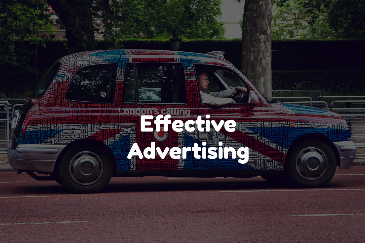
brand trust

Car Magnets Promote A Sense Of Trustworthiness

One of the most essential and invaluable things vehicle magnets promote is trustworthiness. As prospective clients see you or your customers driving around with your logo all over the vehicle, they will automatically assume that your brand is trustworthy—after all, why would everyone be sporting your logo if you weren’t? Compared to billboards and yard signs, which seem like a more self-serving way to advertise, car magnets promote a sense of community and intimacy that a large sign, business banner or campaign sign could never match.

Beyond that, car magnets are usually manufactured with versatility and durability in mind. In addition to being constructed from a highly resilient magnetic material, quality magnets are extremely resistant to the elements and will look nice for years to come, even in dismal weather conditions. In terms of maintenance, most magnets can be removed and cleaned whenever you need, just be sure to follow whatever cleaning instructions are provided to make sure nothing happens to the magnet or your vehicle.

Once you place a few car magnets on your vehicle, you will be able to advertise your logo, slogan, and services wherever you go. Most magnets are designed for safe use with any steel surface and any paint job (again, provided you follow the proper cleaning instructions). Additionally, consider pairing car magnets with yard signs for a promotional double whammy. Together, these two products form an effective advertising combo that is sure to give your small business a necessary boost.

Vehicle Magnets Are The Perfect Way To Amplify Your Message

As prior studies indicate, car magnets are proof that there is no better way to amplify your message while creating the necessary space for handling business as usual. Once you have strategically placed your magnets on one or more vehicles, everything they are affixed to essentially becomes a mobile billboard, giving you a razor sharp advantage over the competition—especially when compared to businesses that have only invested in static methods of advertising, such as a billboard.

However, the advantages don’t stop at brand awareness or conveying particular messages. That’s because car magnets are the perfect way to save money on advertising while still making a meaningful impact on the market. They truly are one of the most economical ways to make your voice heard while saving considerable sums of money that would otherwise be spent on lavish billboards or expensive commercials.

You could use your car magnets in any or all of the following ways:

  • Highlighting important brand information
  • Promoting general brand awareness
  • Conveying a promotional message
  • Familiarizing people with your mascot, logo, or icon

Strong Returns on Branding

Car Magnets Provide The Biggest Return On Your Investment

Think about how much driving you do in a single day. How much of that consists of time spent on the freeway or crowded residential areas, where you may literally pass hundreds of vehicles? Think of all the difference a cleverly designed magnet or two could make in these situations. No matter where you go, you create the potential for generating more revenue for your business or attracting more attention to your message.

If you think one magnet will not be enough, consider placing an order for two or three. Affixing a magnet on each side of your vehicle as well as on the rear creates plenty of opportunities for people to see them. You should even consider experimenting with various sizes, which also afford their own distinct advantages. For example, placing two equal-sized magnets on the side of your car and a larger magnet on the rear is a great way to capture the attention of just about any passerby.

Applying And Removing Magnets Is A Cinch

Maintaining car magnets is usually quick and easy. In addition to being easily removable, they are extremely easy to clean. In most instances, all you have to do is apply a small amount of soap, gently rinse, and you are ready to go. This way your magnet will always be legible to everyone who passes by.

In most cases, applying your car magnet is as easy as following these steps: first, make sure to carefully clean the surface where you will be applying the magnet. A small amount of soap should suffice—however, if your vehicle is extremely dirty then it may be a good idea to give it a more comprehensive cleansing.

Next, ensure that the surface is completely dry. As with the previous step, be sure to focus on the area or areas where you want to apply the magnets. This will help you avoid compacting dirt and grime into your vehicle’s paint job and optimize your magnets for years of use.

Once everything is prepped and ready, double-check your work then go ahead and apply the magnet. Take care to massage out any curves or bumps, as these could cause problems down the road. To prevent any long term damage, even without bumps and curves, be sure to clean and dry the space underneath the magnet on a daily basis. Additionally, make sure that you remove the magnets whenever you get your car washed, as not doing so could result in loss or damage to the magnet.

Branding Considerations

Things To Keep In Mind

Before you finalize the design of your magnet or spend so much as a dime for that matter, you should thoroughly consider whether or not the look of the magnet (i.e., it’s color and general aesthetic) will vibe with your vehicle. Nothing stands out more than a dazzling color scheme, and your vehicle is certainly part of the equation. In this regard, keep in mind that minimalism is the hot trend right now—so when it comes to designing a custom magnet, less is definitely more.

Most people only have a limited number of seconds to read a vehicle magnet, so using large letters in tandem with short phrases is an excellent approach. The font choice should also correspond with your other marketing materials to promote a sense of uniformity. Additionally, consider using a border around the sign, as this has been known to focus attention and make content easier to read.

In regards to color combinations, using darker backgrounds with lighter colors optimizes readability and, depending on the colors, usually doesn’t result in significant eye strain. Get creative with your color scheme to focus viewer attention on the most important information, such as your website, phone number, or the sense of gratification your customers will get from doing business with you. Some studies have shown that simply rendering your most essential text in a different color can increase retention by as much as 75 percent.

The 10 Most Creative Ways to Advertise With Yard Signs

Table of Contents

In addition to their affordability, yard signs are both lightweight and portable. With this in mind, it’s no wonder why they are so popular with both large and small businesses alike. That’s because no matter the size of the business, yard signs are an excellent means of capturing the attention of anyone who passes by.

However, while yard signs do contain a ton of potential, there are other factors you need to consider to amplify their effectiveness. After all, a sign without a coherent strategy isn’t all that effective, is it? So before you spend so much as a dime, ensure that the text you are using is proportional to the overall size of the sign and the distance of visibility you hope to achieve. Additionally, make sure your color scheme is simplistic and straightforward to capture the maximum amount of attention.

Needless to say, yard signs can be appropriated for various uses and applications. To help give you a better idea of potential uses, here is a list of 10 creative ways to use yard signs.

Custom Yard Signs

1. Yard Signs Are Ideal For Home Businesses

Working from home comes with distinct advantages—unfortunately, crowds are not one of them. While most businesses attract a decent amount of foot traffic, working from home may mean you are tucked away from all the action. However, a cleverly placed yard sign will ensure that you can capture a sizable customer base by appealing to them as they drive by. It will also attract the attention of your neighbors and any visitors they may have.

When placing a yard sign in front of your home, check local ordinances, as you may be able to carry out some tricks that will give you another leg up on the competition. For example, you may be able to place a few signs at the end of your block, cul-de-sac, or even at an intersection. Even better, yard signs are inherently mobile and can be moved wherever you desire.

2. Raise Awareness For Nonprofit Organizations

As far as your nonprofit organization is concerned, yard signs make it that much easier to make an impact. Whether you aim to point people towards a secure donation box or initiate a dialog with one of your representatives, yard signs work best when erected in high-traffic areas with ample visibility. To further inspire people, you could even include some of your talking points and desired results or explain more about how donations will be used. However, you should be cautious of cluttering your sign too much, as doing so could drive people away. What better way to raise awareness for a particular cause than with a yard sign? Placing a sign in your yard is a great way to compel your neighbors to do the same, which will only serve to further amplify awareness and rally even more people around the cause. Just be sure your sign contains a concise summary of the objective, as well as legible contact information so anyone wishing to obtain additional information can do so.

QR Code Yard Signs

3. Ever Thought Of Using A Yard Sign For A QR Code?

This one is a little more esoteric but is becoming more imperative by the day. Yard signs are great for displaying QR codes. Simply use an online generator to create your code, print it to a sign, then place that sign in your yard. If programmed correctly, the QR code should link to a page that will enable you to provide potential clients with more information, as well as monitor the effectiveness of your yard sign.

4. Give Your Political Campaign An Extra Edge

When it comes to political campaigns, name recognition is essential. This is precisely why you see so many political campaign signs pop up as election day gets closer and closer. Indeed, these yard signs have become essential to running an effective political campaign. So if you are planning on using a yard sign to raise awareness about a campaign or cause, be sure they include the name of the candidate or cause, as well as all necessary information required to make an informed decision when it comes time to vote.

Custom Fundraiser Signs

5. Promote School Fundraisers Throughout Your School District

Do you or your children have a school-related fundraiser coming up? This is the perfect time to place an attractive yard sign on every street. Regardless of whether your fundraiser is a one-off or recurring event, a few cleverly placed yard signs are sure to lure many prospective customers.

6. Buy and Sell More Real Estate

Yard signs are perfect for real estate companies looking to raise awareness about specific properties available for sale or lease. However, you may have noticed that they are quite overused. With this in mind, your sign must stand apart from the competition, at least if you want to capture a decent share of the market. Here is a short list of effective tips, followed by more comprehensive descriptions:

  • Conceive a creative color scheme
  • Make sure your yard sign has a distinctive shape
  • Use an effective tagline
  • Affix a brochure that customers can use to glean more information

When it comes to color schemes, don’t be afraid to take the time to decide exactly what works best for you. Changes may be dictated by demographic preferences as well as natural surroundings. A good rule of thumb is to notice what colors are popular within your area, ascertain the reasons why then implement them into your own designs where applicable.

As far as selecting a distinctive shape is concerned, make sure to choose something that the surrounding area does not see every day. A sign with abstract dimensions that simultaneously provides extra room for additional graphics, text, or negative space will help underscore your brand. However, be careful not to clutter your sign with too much information, as this will detract rather than attract. Additionally, try to focus on a single unifying message that will simultaneously entice buyers and push your brand.

Yard signs and taglines go together like peanut butter and jelly. Just be sure to take the time to craft an effective tagline rather than rushing through it just to get your sign-up. Keeping your primary goal and focus at the forefront of your mind will help you assemble the perfect text.

Finally, attaching a brochure box will enable prospective buyers to find more information about the property, as well as obtain an efficient means of contacting you.

Custom Party Signs

7. Personalized Yard Signs for Parties And Other Celebrations

Make your next social gathering a smash with a personalized sign. No matter whether the event is a birthday party or that pool party you’ve been waiting for all summer, a prominent yard sign will ensure that your guests will know where the party is at. If your event is reasonably large or located in a hidden place, you may want to consider purchasing multiple signs with different instructions on how to navigate the area. Additionally, you could use signs to direct guests to key areas such as restrooms, trash receptacles, and food stations. Think back to your own childhood experiences on days like Easter. Wouldn’t an egg hunt have been much more fun with a couple of creative signs? In addition to informing people about the celebration in the first place, a few well-placed yard signs will result in even more fun. Just think about how you could confuse people or give understated hints about the location of specific eggs.

8. Yard Signs to Help Recruit the Best Employees

If you are a business owner looking for a way to accelerate your hiring process, look no further than a few yard signs. Placing a few of these puppies here and there will promote more visibility than other forms of signage and give you more control over how your message is displayed. Before printing your sign, consider what questions potential employees may ask, such as those pertaining to wages and hours, and be sure to include them in the text.

9. Conventions, Conferences, and Other Large Events

Even if the concert or convention you are promoting has been sold out for months, it never hurts to have a little more signage here and there. While signs can certainly raise awareness about an upcoming event, they can accomplish much more.

For example, in the case of a sold-out event, a prominently placed sign is the perfect way to direct the crowd to essential stations, such as restrooms, food, designated exits, will-call, and ride-share pickup locations, and much more. You can even tell people where not to go using signs with messages such as “Keep Out” or “Restricted Access.” The possibilities are virtually endless.

Random Uses

10. Spread Your Own Personal Brand of Joy in a Troubled World

What if you just want to place a sign in your yard because you feel like it? Nowadays, we are so bombarded with sales and related messaging (not to mention divisive political ads) that we forget life is supposed to be fun. Bring some much-needed cheer into your neighborhood with a random sign that conveys a funny or sentimental message that will brighten everyone’s day and bring us closer together.

No matter the use, or whether you opted for I-frame or wire stakes frames, a tactfully placed yard sign is sure to get the point across. As with any public display, be sure to check with local authorities regarding specific rules governing signage. Doing so will help you avoid any unwanted confrontations.

Depending on the intended use, you may want to consider one of the following: ordering multiple copies of a single design or ordering multiple copies of several unique designs. Multiple copies of a single sign are great for handing out to friends and neighbors, but they could cause people to overlook the message if too many are placed in the same vicinity. On the other hand, ordering several unique signs gives you the option of diversifying your message to yield a much higher return.