Real Estate Signs

Using Custom Yard Signs to Promote Your Special Event

Table of Contents

Could custom yard signs be the missing link when it comes to publicizing your next big event? With yard signs, you can quickly and easily create a customized message that will resonate with potential attendees – but only if they’re carefully planned and designed correctly!

It’s not just what kind of signs you use or where they’re installed – EVERYTHING matters, including when you order them, what they look like, and how you install them. We have some tried and true tips explained below that will help you find “sign success” for your next event.

When to Order Your Custom Yard Signs

The most important part of throwing a good event is planning.  That’s why you should order yard signs at least one month before your event (or as soon as possible). While this might seem like an unnecessarily long period of time, many things can happen between now and then. Typical sign production at our shop can take around five business days, and we’re much faster than most. Then, you should expect to add another 2-4 days for shipping. Even if you don’t have this kind of lead time, make sure you don’t put off ordering your signs until the last minute. Rush jobs always add stress and cost to the project and you might end up with a sign that says “Hapy Graduation” (even though our design team prides itself on its incredible attention to detail). 

Where to Place Your Yard Signs

Audiences require convenience, so your event signage must accurately and simply direct guests to the intended location. It’s a poor strategy to have guests getting lost or meandering around the countryside –  and this is especially true if they’re a necessary part of the event. Signage should be placed in a yard or along roadside corners to be seen without obstructing traffic. 

Use Common Sense and Obey Local Regulations

When posting yard signs on someone else’s property, asking landowners politely can go a long way – especially if you throw in an invitation to the event.

When you receive your yard signs, be respectful of where you place them. You want to place your custom yard signs on a busy thoroughfare or corner, but not if it’s along a high-speed highway, on-ramps, off-ramps, or utility poles. Sign placement might be allowed on state and county roads, so long as they don’t create traffic hazards or block traffic and stop lights. 

Even if you want to post a sign in your own yard for a short while, be sure to check local ordinances regarding sizes and quantities of signs. You wouldn’t want an unpleasant encounter with law enforcement, so always consult the appropriate authorities before posting anything

When Should I Place My Yard Signs Outside?

When to place event signs depends largely on the type and location of the event. If you’re hosting a political fundraiser, a good rule is to place event-specific and standard campaign signs outside about two weeks before the event, then take them down within 24 hours. 

Two weeks typically provide enough advance notice for attendees to clear their schedules. Be sure to record where all of your signs are placed since having old signs perched around town is a poor sign of organization.

Lawn Signs for Closed Events

For events that are closed to the public (like graduation parties and weddings), signs can be placed 1-3 days beforehand. It’s assumed that guests have invitations and directions, but big directional signs can be extremely helpful for getting folks where they need to go.

Make Sure You Have the Right Signage

Yard signs are an affordable, highly visual opportunity to promote nearly any event, including: 

With nearly unlimited options to channel your creative side, it’s important to match an event’s advertising with its personality. So how do you do it? 

How to Make Your Own Yard Sign

Our super cheap yard signs offer flexible designs and durable materials to get your event the publicity it needs. Start with our straightforward online ordering process – you’ll create your custom yard sign in minutes.

Stay organized and plan to make your event a hit.

Join the thousands of businesses that trust Super Cheap Signs for their signage needs. See why we’re the go-to choice for affordable, eye-catching signs. Explore our store page today!


Open House Signs that Attract More Buyer Attention

Preparing for an open house takes a lot of work. Often the homeowner must deep clean, de-personalize the home, bake cookies, landscape for curb-appeal, perform minor repairs, and list the open house online. After all of that, you would think that potential buyers would be busting down the door to take a peek. However, many homeowners forget or are unaware of the steps it takes to attract buyer attention for the event itself. 


Open house signs are easily recognizable and a cost-effective option for advertising the event the day of. There are a variety of open house signs available to choose from, and there isn’t a one-size-fits-all solution when it comes to effective open house sign marketing. So, how do you know which one is right for your home and neighborhood? Below are a few ideas on what types of signs attract more buyer attention and how you can use them for your open house.


Signs That Say “Open House”

This should be a no-brainer. However, if a sign just says “For Sale”, potential buyers won’t know there is an event happening the day of or at all. If you want them to come through the door, the sign has to be clear that you’re hosting an open house and when they should stop by.


Directional Signs

If a home is tucked away in a neighborhood or it’s not visible from any main roads, directional signs can be helpful for leading people to the open house. Placing a sign at the main entrance of a neighborhood or on the closest main road can help attract passersby who don’t live in the neighborhood. The more traffic a road gets, the more potential buyers will see the sign. Some neighborhoods and cities have specific rules involving temporary signs, so it’s important for homeowners to learn these rules before accidentally breaking one.


Repetitive Signs

Several signs before the entrance of the neighborhood not only catch the attention of passersby, but they can also serve as alerts and reminders of where to turn so they don’t miss it. Each sign can say something different or contain only one word each to form a whole sentence. Either way, multiple signs are hard to miss.


Informative Signs

Signs with the date, time, price, and basic information about the home can help buyers determine if the home fits their criteria in the first place. Open houses that waste everyone’s time aren’t profitable, so informative signs can help weed out the outliers. Informative signs are usually placed in front of the home with the most important information in the largest lettering so people don’t have to get out of their cars to read it. Too much information on a sign can overwhelm a potential looker, and small print is difficult to read from far away. Contrast and color can help signs stand out around the landscape and are easy to read for someone driving by.


Humorous Signs

Humor is an easy way to grab someone’s attention when marketing for anything, including homes. Phrases like “It’s what’s on the inside that counts” or “Say yes to the address” can peak the curiosity of a potential buyer at the very least. Creative and clever home promotion tactics will attract buyers’ attention at the very least. This strategy may be more successful in certain areas or neighborhoods, and a realtor may know best if it will work in yours.


Creative Placement

Open house signs aren’t restricted to neighborhoods and in front of homes. To widen the search radius, some realtors will create open house flyers and post them in coffee shops, grocery stores, or wherever local ads are displayed. To prevent random strangers from showing up to the house late at night, these may only want to be promoting the open house for a couple days or just the day of the event. The home address doesn’t even need to be shared if there are signs leading to the home from the entrance of the neighborhood. When thinking about open house signs, there are more ways to promote an open house than just the traditional signs and methods. Creativity and strategy can lead to a wildly successful open house, and even a contract at the end of the day.

How the Use of Business Cards Have Changed in the Last Decade

While there was a time when it seemed like every person couldn’t hand out their business cards fast enough and everyone had a collection of various cards gathering dust in their wallets, it seems that the popularity of business cards is finally starting to wane. While the explosion of business cards a decade ago was at times overwhelming and oversaturated, by no means are business cards dead today. In fact, there are many situations, settings, and cultures where business cards are still relevant. The way society uses business cards now, however, has slightly evolved in the past ten years.

Businesses are choosing quality over quantity of transactions. 

A decade ago, entrepreneurs may have handed out their business cards to every person they met in hopes that a few of them would convert. After years of trying this method, it’s apparent that a one-dimensional card isn’t the only factor that potential clients or network partners use to determine whether or not they will work with you. Today, a personal connection is often made before a business card is ever passed off. People who have experienced a positive interaction with someone are more likely to keep the card than those who haven’t. 


Creative designs are helping businesses stand out.

Business cards used to be quite basic. After collecting a myriad of similar looking white cards, they all start to blend together to a potential client. To stand out, businesses are now getting creative with the design and look of their business cards. Not only is color a big deal now, but different shapes, interactive cards, and even see-through cards are more popular now than ever before. Unexpected and creative touches to a business card help clients remember the giver and can help promote a brand even further. Especially unique cards may even get shared dozens of times on social media, furthering brand promotion.


Information shared is evolving.

Most business cards contain basic contact information such as phone number and email, along with the name of the person, the name of the business, and the website. However, with the rise of social networking, professional social media accounts are a must-list for modern business cards. People are more likely to find a company on a social media channel than keep a business card anyway, so many businesses are using their cards to bridge this gap instead. Professional headshots and calls to action are also commonly included on business cards today, as they are still widely used in a business’ marketing plan. 


Touched on above, handing out business cards to everyone and anyone is no longer considered an effective strategy. Businesses are now focusing on creating personal connections before passing off their contact information to a potential client or network partner. Instead of having a business card be the beginning, middle, and end of an interaction with someone, they are saved for the good-byes after a conversation has been had if the person wants to keep in touch. A decade ago, business cards held little value because everyone got one. Now, business cards are mainly given to people most likely to keep them and use them. 


Business cards are still viewed as the most professional hand-off of contact information, and it can be embarrassing to a business owner when they are caught without one when asked. Even with digital sharing of information, business cards are still the quickest and easiest way to exchange information, especially with certain audiences and in certain settings.


Business cards are used within rather than outside of a company. 

In large companies, employees are often given their own set of business cards. This can be helpful for promoting the business when they are off the clock. However, they are also helpful for a quick exchange of information with co-workers in other departments. Increasingly, it is becoming common for employees to utilize their business cards this way, especially if they are somewhere away from their computer or phone.


The way business cards were used in the past is certainly dead, and we are probably better off because of it. However, today’s adaptive business cards are still very much useful, especially when a unique element is incorporated into the design or they are given to the right people. If business cards aren’t working for a business, it may be time to update them!

Four Unique Ways to Integrate Business Cards into Your Marketing Strategy

You just bought a box of 10,000 business cards (because that’s what all business owners do, right?), but now what are you supposed to do with them? Some entrepreneurs feel awkward handing out their business card at networking events, while others are naturals at it. Are you supposed to give your business card out to everyone you meet, or should you target certain audiences? If you aren’t sure how business cards can be implemented into your marketing strategy, take a look at four unique ideas below to help you get started.


Partner with Related Services

The easiest marketing is when someone else does it for you, right? If you have worked with partner companies in the past, and they aren’t direct competition, it may be worth contacting them about displaying your cards for customers in need. For instance, a web design company can display cards for an online marketing company, and vice versa. If you’ve already built a trusted relationship with the company, they will naturally promote your business anyway. Give them a stack of cards to make it easier!


Include Special Offers or Discounts

When designing your business cards, think about who you will primarily be handing them to. Will they be new prospects, repeat customers, potential network partners, or perhaps all three? You may consider including a promotion or special discount on a percentage of the cards for potential customers so they are more likely to keep your card for future reference. People love saving money and finding a deal. Give them a reason to hang on to your card rather than toss it in the trash. 


If you want your discount to be flexible based on seasons or holidays, you can include a basic discount code (such as the name of your business) that customers can enter and you can change depending on what you want the discount to reflect. If the discount always stays the same, such as 10% off for every new customer, then the clarity can help customers remember exactly what they are keeping the card for. Punch cards or referral discounts can also be applied to the back of a business card, and be all the more reason for a customer to hang on to the card.


Include Landing Page Link

As part of your marketing strategy, you may have already created a landing page that is designed specifically to draw new customers into your brand and lead them to conversion pages. Instead of listing the basic home page of your website on your business cards, why not perform double-duty and list the landing page instead? As long as the landing page has a readable URL and easy for customers to type in (especially think about mobile users!), then this can be a great way to integrate in-person and online marketing strategies.


Get Creative with Placements

Not every business owner has time to attend a dozen networking events, conferences, or trade shows every year. Instead, they may have to find other creative ways to get their business cards in the hands of target prospects. Luckily, there are plenty of opportunities in every day life to strategically place a business card. 


Community boards at coffee shops and grocery stores are easy and free ways to market a business. You can also head to a local bookstore or library and stick your business card in a few industry-related books (as long as the people in charge are cool with it). Or, you can hide a few of your business cards around town and make a scavenger-hunt type game out of it where the customer gets a discount if they find all of them. 


There are tons of creative ways to get your business card out there rather than spending hours talking to strangers at an event. The four ideas listed above are a few of the more unique ones to get the creative juices flowing. Business owners can also utilize friends and family, friends, neighbors, past clients, and co-workers to pass out cards, or include their cards in a mail marketing campaign. While in-person connections are always the most effective when it comes to a business card exchange strategy, it doesn’t mean you can’t get your information out there even when you can’t be physically present!

Seven Business Card Designs of the Future

Nearly every modern business utilizes business cards to promote themselves, yet they are often tossed in the trash by their recipients by the end of the week. While business cards continue as a staple in the business world (and it’s nice to have one available when a client asks), businesses need to adapt their cards to fit ever-shifting trends and stand out amongst the competition. Otherwise, the expense and hassle of creating a business card is a total waste. 


What inspires a client to keep your card in their wallet rather than toss it when they get home? For one, your business card must be eye-catching. You can achieve this through fonts, brand-colors, phrases, imagery, or even the shape of the card itself. Of course, the most important goal of a business card is to convey useful information to the client, such as name, email, website, and professional social media pages. If you aren’t sure where to begin in your business card design brainstorming session, take a look at the top seven on-trend business card designs of the future below to spark an idea or two.


Minimalistic

A business should convey some information on their business card, but overstuffing and overwhelming a card can be overkill. A customer doesn’t need to know details about specific products or services on a business card. They do need to know your website to find that information, however. Keep it short, sweet, and simple when it comes to how many lines of text you decide to include on your cards.


Along with the amount of words on the card, minimalistic amounts of color, fonts, and images are also on-trend right now. A single-color background with just the business name or logo on the front can help a card look clean, fresh, and professional. You can play around with foiled lettering or different textures to make it unique and un-boring. The important business information can be listed on the back without cluttering up the simple and bold advertisement on the front.


Transparent

Another interesting design idea that has been recently floating around is that of transparent business cards. A specific brand color or pattern can be applied to the transparent paper, but the uniqueness of the see-through design can help it stand out amongst competitors. Of course, transparent cards don’t work with every type of business, especially since transparency conveys a certain message. For instance, a data privacy company may not want see-through associated with its name. However, it may fit the theme of a window company. The takeaway is that businesses are no longer limited to traditional cardstock for business card backgrounds, and they can experiment with different types of material.


Out-of-the-Rectangle

Businesses are no longer limited to the traditional rectangle shape for business cards either. To stand out, some businesses are experimenting with different shapes and sizes for their business cards. Of course, business cards should still serve the practical purpose of storing until future need and easily fit inside a wallet or card carrier. 


Interactive

Depending on the type of business, interactive cards can be a fun way to hold the attention of a client or future client. Cards that fold into different objects or have hidden pull-and-slide messages are unique and fun for clients to fidget with when they are familiarizing themselves with your contact information. If anything, these types of cards will definitely be remembered for their distinctive designs.


Social

Just like other types of marketing, business cards should display professional social media accounts as a way for customers to connect with a business. Even if they don’t use the services or products right away, they may want to connect digitally before tossing a card. If a business spends a lot of time marketing and/or selling on social media, this is essential information to include.


Humorous

Humor is a universal language, and it can stand out and intrigue just as much as a color scheme, font, or design. Humor, puns, and sarcasm especially resonate with younger target audiences. Whether it’s through clever imagery or a play on words, many businesses are now incorporating humor into their business card designs to help make a lasting impression with their clients.


Multi-Purpose

A business card can serve two or more functions if you get creative. Instead of handing out multiple cards for different purposes to potential clients, why not just hand them one? If you offer 10% off to new clients, you can include this deal on the card. Or, if there’s a page on your website specifically created for potential clients, you can put this URL on the card in place of the standard homepage. You can even turn a business card into a “frequent customer” card and offer a free product or service for every 10 punches on the back. Businesses are consolidating some of this information onto one card that increases the chances that a customer will keep it longer than a day or a week.

SOLD! How real estate signs have last the test of time among other marketing tactics.

Table of Contents

There are numerous places where you can acquire real estate signs, be it online or at your local print shop. There are also many different styles of real estate signs that you could purchase, but how do you know which one to choose? As we further discuss what makes these signs affordable and captivating, we will discover price ranges, do’s and don’ts, and how to use them to your advantage.

What is a real estate sign?

The most standard form of a real estate sign is a 4mm corrugated plastic sign that commonly comes in the size of 18” x 24” and needs wire stakes or wood stakes to display them. These signs are also known as bandit signs, placards, or real estate lawn signs. More durable signs are made from aluminum and are printed digitally. These signs come accompanied by a steel sign frame that the sign slides into through the top or side. There are also real estate post signs or colonial post signs that are much more expensive but last quite a while. These usually have an upside-down “L” shape and have the sign hanging from the top. Metal or plastic signs can be displayed with the post. Also, the post and sign are usually sold separately, so keep that in mind when making your decision. Vinyl banners can also be used as signage for real estate. It really just depends on the 5 w’s: who, what, where, when and why the purpose of your message to determine the best signage to go with.

Eye-Catching Signs

Now that we know what real estate signs are, we can discuss how to make your signs attract some attention. The simpler the better. Too much clutter from too many words can have your audience shy away from reading your sign. You don’t want that, so simple fonts and bold colors are what you are looking for when trying to make your signs stand out. Also, consider how the words on your signs are arranged. Making your sign as aesthetically pleasing as possible is the goal here, too many words are a no-no. You can try using some of the local lingoes to help spread the word on a new property. Having a good understanding of your community can help tremendously with your future clientele. Where you choose to display your yard signs is going to play a big factor in helping you get more business as well. High traffic areas are ideal for signage. The more people you have passing by, the higher of a chance you have at turning one into a buyer. Another thing to try is making your signs funny. A witty slogan or phrase can go a long way with potential buyers/sellers. Make sure to keep it tasteful, non-offensive, and in-line with what you are trying to promote.

Cost

Corrugated plastic signs are usually going to be the most affordable option. An order of 100, 1 color, one-sided signs are only going to run you around $99 to $250 bucks. That includes the wire stakes or wood stakes. There are local shops or multiple online stores where you can order signs like these. Ordering higher volumes can help get some serious traction buying or selling houses.

Another option realtors go with is the aluminum signs with steel frames. These are a great choice when you need small quantities but also want something more durable. They won’t rust so withstanding the elements is no issue here, but because of the higher quality of material, they will be more expensive. If you ordered 5, 2-sided aluminum signs, with steel frames, you’d be looking at around 180 to 400 dollars.

Lastly, a more high-end choice we’d like to mention is real estate post signs. The post themselves can vary in material-type, such as wood, metal or vinyl PVC. The more common choice is vinyl PVC, since its plastic and less expensive than the other two. If you’re lucky enough to find both the signs and the posts in the same place, capitalize on it. Let’s say you ordered 5 of the post signs. On average, these are going to run you around 550 to 750 dollars. It could be more if you have to buy the signs and posts separately.

Conclusion

After checking into the different styles of real estate signs, it’s a fair assumption to say that the corrugated plastic signs are the most affordable choice. Next would be the aluminum signs with steel frames and lastly, the real estate sign posts. All of these have a similar purpose, but where and how you are displaying your signs will help determine which ones to get. If you have just 2 houses to sell, post signs or aluminum signs with steel frames would be ideal. You can fully customize your design with the tips provided to make them as appealing to your buyers\sellers as possible. Keep in mind that some brokers and realtors may have a franchise manufacturer they would rather you get your signs from. Talk to your company and see what you can do for your promotions. Making the best sign you can for the best price you can get is the goal and hopefully, these suggestions help you achieve just that!

Yard Signs: What They Are and What to Know

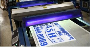
Yard signs fresh of the press!

Why Yard Signs?

Signage has been around for quite some time, to put it modestly. More specifically, however, yard signs are being used as of more recent. Some would even say as early as the 60’s and 70’s, but why. Security alarm companies from that time wanted a new way to thwart burglars from entering a particular premises. What they started to do was put aluminum window signs on to real estate stakes and then introduced the combination to the customer’s yard. Since that time lawn signs have made their staple in advertising and don’t appear to be going anywhere but outside.

Corrugated plastic and a weather-proof ink are what most lawns signs are made of. Of course if you have some cardboard, a magic marker, a wood stake, and a sunny day then you can make a yard sign at your own leisure but that’s why we’re here. We can assist you with all of your sign needs. Our ads vary from real estate, campaign, special events, and much more. Have a custom design that you want to see on a piece of corrugated plastic? Then look no further because our design team is here to help. Or if you just wanted a blank piece of plastic to write your own message on then we can send you that too.

Get Your Yard Signs Noticed!

Now we have to get those signs to stand out and stand on their own. The most commonly used supports are wood stakes and/or H-wires. However, keep in mind our corrugated plastic yard sign material comes not only in 2 colors, but also 2 flute directions. The small spaces located on the bottom and top, or the sides of the plastic are called ‘Flutes’. If you want a sign with wood stakes then you’re going to want the flute direction to be perpendicular to the stake itself. With H-wires the flutes are going to be parallel. The 2 colors we offer are white and yellow, and come in a variety of sizes. Our standard is 18” x 24” but we also offer yard signs in the sizes of 12” x 18”, 9” x 24”, and our biggest of 24” x 32” that can be screen printed. Whether you need signs for your business or political campaign signs, here’s where you can get started!

Real Estate: Get Ready to Move!

Table of Contents

Question: How is real estate like a Zumba class?

Answer: Spring is a super time to move!

And while the sign of someone who’s Zumba-ready is a spandex-clad body and athletic shoes, real estate signs can range from basic yard signs to big directionals to super creative car magnets. The key isn’t just the signage you choose, but how you use it.

So you’re ready to move: Selling a home involves a great deal of time, thought and effort. If a real estate agent or broker is handling the listing, one of their first tasks is creating and placing a real estate yard sign on the property that states the agent’s or broker’s contact information. (If a party is selling the home directly, the sign will usually state, “For Sale by Owner”.)

Next comes sign content. Most critical: the name and phone number of the contact person — unless the sign is advertising an upcoming open house, in which case the sign should state the open house date, time and location (if the sign is placed elsewhere than on the property for sale). And while it can be tempting to create a colorful sign, what’s most eye-catching is a real estate sign that uses only two colors, such as red on a white background on blue on a white background, both of which are easy to read. Red is deemed most effective for attracting potential buyers.

Real estate yard sign placement strategies

Once you’ve created your real estate sign(s), placement is crucial. You may want to use multiple signs, depending on where the home is situated. For a house located mid-block, a single sign facing the street will be noticeable to people driving by from either direction. For wider properties, or those where the home is set far back from the road, we recommend placing a real estate yard sign at each end of the property.

For corner lots, place signs on both perpendicular streets to attract traffic traveling the main road and side street. For country properties that may be far from the beaten path, add spinner signs or big directional signs to attract the attention your property deserves.

Finally, let the web bring you buyers. Today most real estate firms offer a virtual tour of featured homes on their website, so potential buyers can get a sense of their new home before ever setting foot on the property.

Seven Sure-fire Tips for Real Estate Signs

Table of Contents

When it comes to real estate success, it’s not what you say so much as how and where you say it that makes the difference. Try these tips to create real estate signs that will have competitors asking for your secret:

Assess your audience

While some crossover artists are able to bridge diverse worlds (think Adele’s blockbuster album, “21”), this is a rare gift. It makes more sense to sing (or write) to your intended audience. Imagine a group of teen girls turning out to hear the latest rock band, only to watch the group take the stage and croon Frank Sinatra ballads! They’d request refunds. So if you’re selling upscale, designer homes, don’t create signs that appeal to young, middle-income families. Instead, make wealth your central message: “A home for people who appreciate the finer things.”

Tell them what to do!

It seems so obvious it’s often omitted: let prospective homeowners know what action you want them to take: stop by this weekend for an open house; call now for an appointment; email for a full-color brochure, etc.

Testing, one, two

Before you order dozens of signs, test your message on a market sample to make sure it generates the desired result.

Sell the steak

Yes, it’s common practice to sell the sizzle, but then your prospects won’t really know whether the house you have to show them will meet their needs. So give ’em the WIIFMs: “What’s In It For Me?” All the features — and all the benefits.

Be sure to proofread everthing

Did you notice the “y” was missing from “everything”? It’s all too easy to skip over a typo, or leave off essential information, such as your phone number or address. While the team at Super Cheap Signs takes pains to turn out a perfect sign every time, you have the final say. This is “y” it pays to have a fresh set of eyes review everything.

Balance visual and verbal cues

Don’t create a gorgeous sign with lackluster content, or sparkling copy with poor design. Aim for both excellent graphics and high quality content to captivate your prospects. If you need help, just ask us.

Learn from the masters

Do your homework, study what works and what doesn’t, and incorporate the best ideas into your own real estate yard signs. Who knows, someday a recording artist might immortalize your business in song!

Custom Aluminum Signs – So Many Uses!

Do you believe in magic? How about this:

Advertising magic? Believe it!

A material that won’t corrode, is super flexible, lightweight yet strong — and the most abundant metal in the Earth’s crust. Perhaps it’s no surprise that versatile aluminum has the atomic number lucky 13. And aluminum is a team player: it combines in nature with over 270 different minerals.

As everyone knows, one of the most popular uses for aluminum is beverage cans — so if you were really enterprising, you could save your soda cans, hammer them flat, whitewash the existing message and create your own signage! But that’s an awful lot of labor, which might be better spent running your business or campaign.

Aluminum signs can be used to convey important information regarding your property or business.

Fortunately, you can purchase high-quality, .040 gauge aluminum signs for any purpose:

  • A “No Parking” sign to keep desperate drivers from blocking your entry? Check.
  • A fence sign, indicating “Private Property” or “No Trespassing” to keep the incurably curious out? Check.
  • A sign that informs parents and kids when the community pool begins summer swim classes? Of course.
  • A sign that indicates hours of operation for your business’s entrance gate? No problem!
  • Advertising a real estate listing? SOLD!

Whatever type of custom aluminum sign you require, this resilient metal will hold up and look terrific for years to come. You can design it single- or double-sided, in full color or just one or two hues — and with ten sizes to choose from, you’ll find the perfect combination to fit your unique needs.

Just remember: as adaptable as aluminum is, you can’t eat an aluminum sign to get your RDA of essential minerals.