Sign How-Tos

Yard Signs: What They Are and What to Know
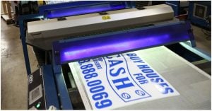
Yard signs fresh of the press!

Why Yard Signs?

Signage has been around for quite some time, to put it modestly. More specifically, however, yard signs are being used as of more recent. Some would even say as early as the 60’s and 70’s, but why. Security alarm companies from that time wanted a new way to thwart burglars from entering a particular premises. What they started to do was put aluminum window signs on to real estate stakes and then introduced the combination to the customer’s yard. Since that time lawn signs have made their staple in advertising and don’t appear to be going anywhere but outside.

Corrugated plastic and a weather-proof ink are what most lawns signs are made of. Of course if you have some cardboard, a magic marker, a wood stake, and a sunny day then you can make a yard sign at your own leisure but that’s why we’re here. We can assist you with all of your sign needs. Our ads vary from real estate, campaign, special events, and much more. Have a custom design that you want to see on a piece of corrugated plastic? Then look no further because our design team is here to help. Or if you just wanted a blank piece of plastic to write your own message on then we can send you that too.

Get Your Yard Signs Noticed!

Now we have to get those signs to stand out and stand on their own. The most commonly used supports are wood stakes and/or H-wires. However, keep in mind our corrugated plastic yard sign material comes not only in 2 colors, but also 2 flute directions. The small spaces located on the bottom and top, or the sides of the plastic are called ‘Flutes’. If you want a sign with wood stakes then you’re going to want the flute direction to be perpendicular to the stake itself. With H-wires the flutes are going to be parallel. The 2 colors we offer are white and yellow, and come in a variety of sizes. Our standard is 18” x 24” but we also offer yard signs in the sizes of 12” x 18”, 9” x 24”, and our biggest of 24” x 32” that can be screen printed. Whether you need signs for your business or political campaign signs, here’s where you can get started!

Winning Yard Signs: How to Make One

Table of Contents

Making an effective yard sign is more tedious than one would probably think. First, you need a design or an image you want to put on a sign. Afterward, you will need to make a stencil for that image; that alone is a multi-step process. Furthermore, the stencil gets matched with a piece of corrugated plastic, so the design registers correctly with a blank sign. We’ll take some ink and transfer the image onto the corrugated plastic. Finally, you have to let the ink cure for a long-lasting, permanent finish that will stand up to any elements and conditions it may be up against. Now that you’ve done all the hard work, you’ll have a high-quality and durable plastic sign ready to start working for you.

Making a Yard Sign Stencil

Let’s back up and start from the beginning once you choose a design or image you want to use for your business advertisement or campaign sign, it’s time to make a transfer film. This film, in essence, is the negative image of your sign. With the film made, we take it to a dark room and transfer it to a silk screen that has already been coated with emulsion. The emulsion is a photo-sensitive material that comes in the form of a liquid. It’s extremely viscous and needs to have sensitizer added to it. This process makes the emulsion photo-sensitive. Take the mixed emulsion and add a very thin coat to the screen; wait for it to dry. The screen is now stencil-ready.

We take the film from earlier, place it on an exposure table, and then cover it with the prepared screen. Go ahead and fire up that exposure table so it can begin to emit ultraviolet light. Some emulsion on the screen will come into contact with that UV light. As a reaction, those areas of emulsion get trapped on the screen. The film blocks out the rest of the light from touching the rest of the emulsion. For about 30 seconds, we wait for the UV light to do its thing.

Time to rinse. Remove the screen from the exposure table for this next part. Hit the screen with water, and the unexposed emulsion should fall right out. This works best with pressurized water. Once you’ve gotten the image rinsed out, you’re left with the stencil that will be used for making the actual yard sign. Again, it needs to dry.

Print-Ready Yard Sign Templates

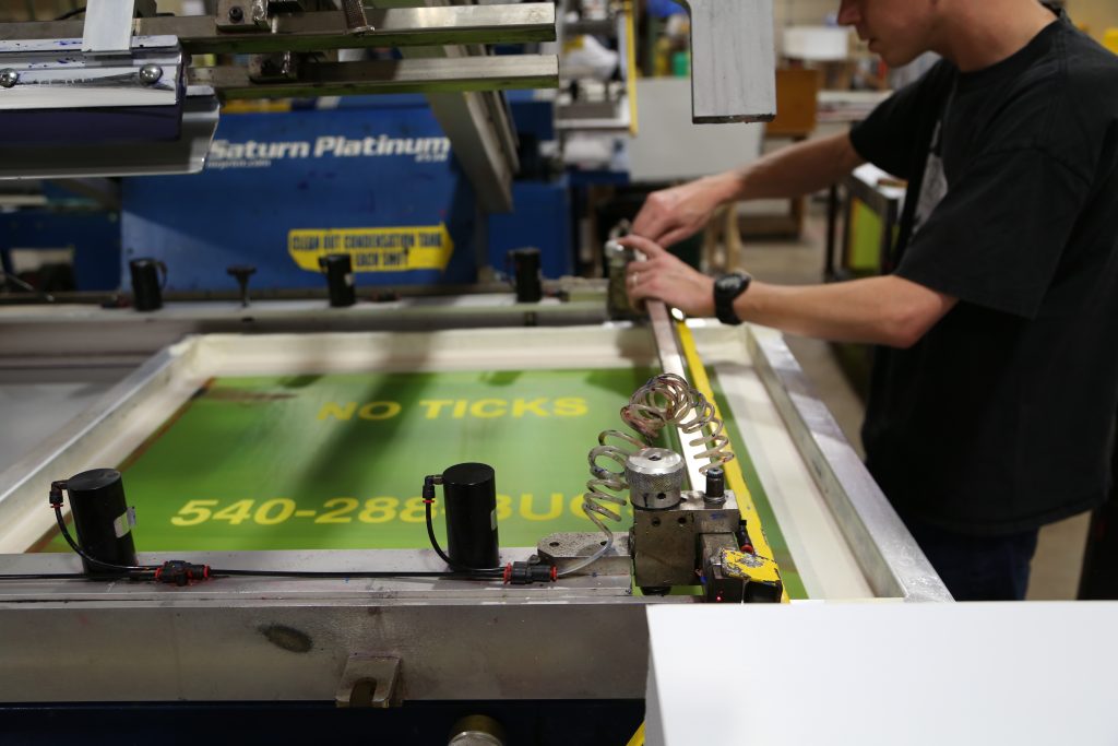
Now we’re ready for printing. From here, we put the stencil onto a printing press or printing table and firmly secure it. This will stop the screen from moving during the printing process. Now we have to register a blank sign under your stencil, then add some ink. This is usually UV ink, so it will last longer outdoors. Next, you will have a squeegee that swipes the ink through the entire image from top to bottom. If done correctly, you now have a freshly printed yard sign with wet ink. The final step is to leave your sign out to dry, or you can cure it quickly with direct exposure to sunlight.

This is just one description of how the screen printing process can be done; however, there are multiple ways of accomplishing the same task. Here at Super Cheap Signs, we use automated presses to do the same thing and achieve a higher level of productivity. Hopefully, this helps give a better understanding of how an idea turns into something that can be showcased for all to appreciate.

Keep It In the Community: Local Marketing

In our incredibly shrinking world, “local” sounds almost anachronistic. When we can have BFFs across the country or across the globe up close and personal at the stroke of a screen, when couples have transcontinental relationships, when our food is shipped fresh and bright to grocery store shelves from another country, does GPS makes sense anywhere except in a vehicle?

Surprisingly, yes. The Go Local movement is gaining ground. From farmer’s markets to Yelp reviews, Google Maps to hyper-local ezines, people are hungry to learn more about their immediate neighborhood. Until we can drink virtual latté, this trend will likely continue.

What does Go Local marketing mean for signage?

  • Sign up for the local angle. Consider affixing “Buy Local” decals to your products or packaging to remind customers you’re a local business, and that by buying your products, their dollars remain in the community to boost the local economy. Your in-store banners and external marketing products such as sandwich boards and spinner signs should all carry the “Buy Local” theme.
  • Socialize locally. Social media is global, but that doesn’t mean your business can’t play up the local focus. On your Facebook page, for instance (yes, your business definitely needs to have one), you can reward new and existing customers who “Like” your page — which also tells other site visitors that they prefer to shop locally. The thank-you for a “Like” can be anything from a one-time discount to a small gift with their next purchase — a simple way to acknowledge support and let them know you appreciate their business. Be sure to include an image of your “Buy Local” signage on your Facebook real estate.
  • Support the community. Does the high school football team need signage for their stadium? Could your town’s SeniorCenter use some help hanging holiday banners, balloons or lights? Every community offers numerous opportunities to make a difference — and the positive PR for your business is a nice side benefit.

Who knows, with all this local emphasis, you might just find a new best buddy across town, rather than across the world.

Foam on the Range: Foamboard signs

Everybody from kids to grandparents loves foam. Think Nerf balls, foam baseballs, paddleballs, mattress toppers, yoga mats…the list goes on. So if you’re foaming at the mouth trying to come up with creative ways to say the same thing differently with your advertising, think foam, foam on the range: foamboard signs, that is!

Foam is where the art is. Foamboard is a backing material widely used in framing art: a superior quality, versatile foam sheet sandwiched between PVC plastic to give you reliable results every time.

Foamboard is fabulous for advertising everything from your store’s holiday sale to a new product display. You can write on foamboard with Super Cheap Signs’ permanent markers, creating a personalized message for your special audience. You can even use foamboard for spinner signs, adding to its adaptability. While they’re ideal for indoor use, foamboard signs are relatively durable in outdoor weather, too, holding up for awhile even in the rain before beginning to dissolve. (This can also be a fun experience for employees with a quirky sense of humor.)

When you use our foamboard for indoor advertising, however, the main caveat is to prevent people from wanting to play with it the way they do with packing peanuts. Maybe you’ll want to keep some play foam around to distract your more artistic customers. A game of Nerf baseball, anyone? Super Cheap Signs got you covered.

The Grandfather of Creative Genius

In Marketing Magic/Part 1, author Debbie Millman discussed how to become a brand genius. Now she deconstructs the creative process itself as she recounts the wisdom of iconic graphic designer Milton Glaser, famous for the I♥NY logo and the poster of Bob Dylan in profile, his hair a psychedelic swirl.

Celebrated as the greatest living graphic designer, Glaser offers a wealth of insight that can help business owners create compelling signage. Take this story of how he became an artist:

“When I was a very little boy, a cousin came to my house with a paper bag. He asked me if I wanted to see a bird. I thought he had a bird in the bag. He stuck his hand in the bag, and I realized he had drawn a bird on the side of a bag with a pencil. I was astonished! I perceived this as being miraculous. At that moment, I decided that was what I was going to do with my life. Create miracles.”

While a sign doesn’t have to be fine art, there’s no telling where tomorrow’s critically acclaimed work will originate. You might think you’re simply designing a banner for your business — but if the combination of design, colors and verbiage strikes a chord, in the cyber age anything is possible. Thanks to YouTube, Facebook, Twitter, Instagram, Pinterest and many other social sites, unknowns become global sensations literally overnight.

Or maybe it’s a banner flag: the hybrid that makes a bold statement for your business, and is made to endure for seasons to come. At 11.5 feet tall and 2.5 feet wide, banner flags are hard to miss. And with our full-color UV-protected dyes and free design, proofing and logo re-creation, all you need to add is the creative genius.

So go ahead: create a miracle and let that banner wave all over cyberland, drawing customers to your door and kudos for your artistic brilliance. We’ll just remain quietly in the background.

Real Estate: Get Ready to Move!

Table of Contents

Question: How is real estate like a Zumba class?

Answer: Spring is a super time to move!

And while the sign of someone who’s Zumba-ready is a spandex-clad body and athletic shoes, real estate signs can range from basic yard signs to big directionals to super creative car magnets. The key isn’t just the signage you choose, but how you use it.

So you’re ready to move: Selling a home involves a great deal of time, thought and effort. If a real estate agent or broker is handling the listing, one of their first tasks is creating and placing a real estate yard sign on the property that states the agent’s or broker’s contact information. (If a party is selling the home directly, the sign will usually state, “For Sale by Owner”.)

Next comes sign content. Most critical: the name and phone number of the contact person — unless the sign is advertising an upcoming open house, in which case the sign should state the open house date, time and location (if the sign is placed elsewhere than on the property for sale). And while it can be tempting to create a colorful sign, what’s most eye-catching is a real estate sign that uses only two colors, such as red on a white background on blue on a white background, both of which are easy to read. Red is deemed most effective for attracting potential buyers.

Real estate yard sign placement strategies

Once you’ve created your real estate sign(s), placement is crucial. You may want to use multiple signs, depending on where the home is situated. For a house located mid-block, a single sign facing the street will be noticeable to people driving by from either direction. For wider properties, or those where the home is set far back from the road, we recommend placing a real estate yard sign at each end of the property.

For corner lots, place signs on both perpendicular streets to attract traffic traveling the main road and side street. For country properties that may be far from the beaten path, add spinner signs or big directional signs to attract the attention your property deserves.

Finally, let the web bring you buyers. Today most real estate firms offer a virtual tour of featured homes on their website, so potential buyers can get a sense of their new home before ever setting foot on the property.

Seven Sure-fire Tips for Real Estate Signs

Table of Contents

When it comes to real estate success, it’s not what you say so much as how and where you say it that makes the difference. Try these tips to create real estate signs that will have competitors asking for your secret:

Assess your audience

While some crossover artists are able to bridge diverse worlds (think Adele’s blockbuster album, “21”), this is a rare gift. It makes more sense to sing (or write) to your intended audience. Imagine a group of teen girls turning out to hear the latest rock band, only to watch the group take the stage and croon Frank Sinatra ballads! They’d request refunds. So if you’re selling upscale, designer homes, don’t create signs that appeal to young, middle-income families. Instead, make wealth your central message: “A home for people who appreciate the finer things.”

Tell them what to do!

It seems so obvious it’s often omitted: let prospective homeowners know what action you want them to take: stop by this weekend for an open house; call now for an appointment; email for a full-color brochure, etc.

Testing, one, two

Before you order dozens of signs, test your message on a market sample to make sure it generates the desired result.

Sell the steak

Yes, it’s common practice to sell the sizzle, but then your prospects won’t really know whether the house you have to show them will meet their needs. So give ’em the WIIFMs: “What’s In It For Me?” All the features — and all the benefits.

Be sure to proofread everthing

Did you notice the “y” was missing from “everything”? It’s all too easy to skip over a typo, or leave off essential information, such as your phone number or address. While the team at Super Cheap Signs takes pains to turn out a perfect sign every time, you have the final say. This is “y” it pays to have a fresh set of eyes review everything.

Balance visual and verbal cues

Don’t create a gorgeous sign with lackluster content, or sparkling copy with poor design. Aim for both excellent graphics and high quality content to captivate your prospects. If you need help, just ask us.

Learn from the masters

Do your homework, study what works and what doesn’t, and incorporate the best ideas into your own real estate yard signs. Who knows, someday a recording artist might immortalize your business in song!

Custom Aluminum Signs – So Many Uses!

Do you believe in magic? How about this:

Advertising magic? Believe it!

A material that won’t corrode, is super flexible, lightweight yet strong — and the most abundant metal in the Earth’s crust. Perhaps it’s no surprise that versatile aluminum has the atomic number lucky 13. And aluminum is a team player: it combines in nature with over 270 different minerals.

As everyone knows, one of the most popular uses for aluminum is beverage cans — so if you were really enterprising, you could save your soda cans, hammer them flat, whitewash the existing message and create your own signage! But that’s an awful lot of labor, which might be better spent running your business or campaign.

Aluminum signs can be used to convey important information regarding your property or business.

Fortunately, you can purchase high-quality, .040 gauge aluminum signs for any purpose:

  • A “No Parking” sign to keep desperate drivers from blocking your entry? Check.
  • A fence sign, indicating “Private Property” or “No Trespassing” to keep the incurably curious out? Check.
  • A sign that informs parents and kids when the community pool begins summer swim classes? Of course.
  • A sign that indicates hours of operation for your business’s entrance gate? No problem!
  • Advertising a real estate listing? SOLD!

Whatever type of custom aluminum sign you require, this resilient metal will hold up and look terrific for years to come. You can design it single- or double-sided, in full color or just one or two hues — and with ten sizes to choose from, you’ll find the perfect combination to fit your unique needs.

Just remember: as adaptable as aluminum is, you can’t eat an aluminum sign to get your RDA of essential minerals.

Thirsty for Success: A powerful slogan

Invest in a campaign you believe in! Give your customers something they'll remember and hold onto.
Invest in a campaign you believe in! Give your customers something they’ll remember and hold onto.

The stunning success of the California “Got Milk?” campaign is legendary, and the powerful slogan is now part of the American lexicon. While this kind of advertising accomplishment is exceptional, it’s not the exception; any brand can apply the same principles used to develop, launch and maintain a landmark campaign — or build name recognition for their business.

Here are some of the most valuable lessons from “Got Milk?”. They’re especially relevant for real estate professionals and investors looking to dominate their market, which our real estate signage solutions have been helping them to do for years:

  1. Make New Friends But Keep the Old. Focus first on keeping those who are brand-loyal, because they’re your best source of increased sales.

The California Milk Processor Board (CMPB) chose to target regular milk drinkers, who constituted more than two-thirds of the market and were already favorably disposed toward the product — and thus more open to influence, especially in the short-term.

Entice your existing customers with discount offers and specials before expending energy attracting new business.

  1. Be Candid. If you employ a “Candid Camera” approach to discover how consumers feel about your product or service, you’ll be able to develop strong brand positioning based on these insights.

The “Got Milk?” ad agency removed all the milk from company refrigerators, placed video cameras inside, and recorded employee reactions to discovering there was no milk. In another research study, consumers were asked to forgo milk for a week, then report back. Their stories provided fabulous fodder for future ad direction.

  1. Cozy Up. Find a strategy that speaks to the consumer’s heart — or stomach, or bank account — and go the distance with it.

When the CMPB tried to sell more milk based on its health value, people yawned. But when the CMPB heard what consumers were telling them — that food choices drive milk purchases — they came up with the winning “deprivation strategy”: chocolate chip cookies or peanut butter and jelly sandwiches lost their cachet without the classic accompanying beverage.

What “goes with” your product or service like peanut butter with jelly? Put that on your yard sign or sandwich board and gauge how customers respond, then tweak your strategy accordingly.

  1. K-I-S-S (Keep It Super Simple). A great ad campaign that is too clever can lead to the opposite result from what you intend. Consumers must be able to easily grasp your message and understand what action you want them to take. This is where a powerful slogan is key.

    messypaws
    A great example of a simple, memorable slogan that could lead to an enlarged customer-base and generate new interest in your brand!

In two words, “Got Milk?” functioned as a hook, a call to action and a take-away that could be adapted to a variety of placements. Think, “Got House?” if you’re a real estate professional, or “Got Lumber?” if you’re a builder.

Got the idea? Great. Just order it on the yard sign, banner or car magnet of your choice, and we’ll take it from there.

Signage Recipe: Cooking up Effective Banners and Signs

Ok, so what in the world do I mean by “signage recipe?” I can already hear you thinking that I have gone right off my rocker. But this is a very effective analogy when you get right down to it. Having that perfect recipe for cooking is the goal of chefs around the world. Obviously because this is the only way of making customers remember them and hit sales. Now, let’s relate that to advertising: a perfect recipe is also needed when coming up with advertising campaigns in order to catch the taste of consumers and get their support for your product.
Custom Banners

Your experience may tell you that in order to have an effective banner or sign you have to follow a lot of solid principles that most graphic designers use to create attractive, high impact custom signage that will help you yield the greatest return on your advertising expense. This is true most of the time because they are the experts. Some entrepreneurs spend their money just to get the experts’ advice. However, with a few tips you can save some of that expense and get straight to creating that special sign recipe that will have clients wanting more.

You need to meet with your colleagues to discuss exactly what you want to display on your banners and signs because just one missing ingredient can have a negative effect. You want to be as clear and concise in as little space as possible because the majority of people are either driving by at speeds that demand their full attention (meaning you get just that two second glance to make your impression), or they already have their own goals and objectives in mind when they glance over and you want to create enough lure to make them stop and take notice. A jumble of words will have them walking on pretty quick or turning their attention back to the street.
Custom Sale BannersWe all know about IM and text messages. We also (most of us) have joined one or two (maybe more) social networks online. Etiquette says that all capital letters means you are yelling. While yelling might be what you want sometimes (come on, admit it…) yelling at customers is not one of those times. When creating that special recipe for your banners and signs, do not use all capital letters. Contrary to popular belief, this does not make you message stand out more. Mixing upper and lower case text is friendlier to the eye and has been scientifically proven in visual tests to be more legible. You may have thought (or used?) that using those capitals would a great attention grabber when it can actually have a very negative impact. Remember your manners and who you are. Be polite. Don’t yell. You are not desperate so don’t give that impression!

Be careful when choosing the text font for your message. Don’t overdo the text in an attempt to stand out from the crowd. To maximize legibility of your text use an easy-to-read text. In addition, do not use more than two different type faces in one banner or sign. This is also irritating to the eye and can have people turning away before they ever get your message!

That perfect dish can be a mouth watering delight or it can be a savory hint of flavor and spice. When it comes to cooking, less tends to be better. Too much spice can bury the flavor of the dish. The same applies to advertising. The general rule of thumb is the fewer words the better. This is because you don’t want to jumble your message with a lot of meaningless chatter; doing this will simply make your message a hodge podge and the meaning will be utterly lost on your audience. Fewer words will make it easier for people to retain the message you want to convey. Another key thing to remember: the less you say the easier it is to remember later!

When cooking, “HOT” spices generally have a red label, mild spices tend to have yellow or pastel labels (go on, go check the spice rack…), and bolder spices – those packed with stand out taste – have a lot of black, yellow, white and red in their labels. Have you ever wondered why? No? Well… you should! Color says a lot. You can say SALE in bright red words with a white background and you have just caught the attention of about half the population. Saying Sale in big black letters on a red background will not have the same effect because it appears too aggressive. Your color scheme is just as important as your message.

To make a perfect sign recipe, use a subtle blend of simplicity, color and appeal. Stir gently and serve!