Super Cheap Signs

Yard Sign Placement Strategies

Yard Signs and their many uses

Yard signs are one of the most cost-effective forms of advertising. Whether you are promoting your home-based business or some type of event, yard signs are a great way to get the word out. Yard signs are used for a variety of reasons besides advertising a business or products, such as:

o Selling a vehicle
o Houses for sale
o Property rentals
o Political campaigning
o Network Marketing entities
o Loan and mortgage companies
o Landscapers and lawn maintenance
o Churches
o Builders and contractors

Because yard signs are such an effective form of advertising, all types of businesses and organizations can benefit from using them. When you take the cost of yard signs into consideration, you’re looking at one of the most affordable forms of advertising that a business or organization can use.

Things to consider when placing your signs

It is always recommended yard signs be colorful so they attract the attention of the people driving by. However, the key aspect here is: if you have a nice looking piece of property, you do not want the yard signs to detract from the looks of the property. Make sure that you signs have pleasing and easy to read color combinations and deigns. A nice sign is all well and good, but without a placement strategy, it may not be as effective. Here are a few tips to consider where the placement of your yard signs is concerned.

The placement of your signs is typically determined by the location of your property. In other words, if your house or place of business is located in the middle of the block, you’ll obviously want to place your signs at both ends of your property. If your lot is longer, you might want to consider placing an additional sign in the middle of your property as well as the ones on each end. We also suggest that the signs at the ends of your property are angled slightly so that they face the oncoming traffic as well as the street.

Additional strategies include the following:

  • Signs should be placed in an upright position so that they are at a 90° angle to the ground and should not lean either backward or forward.
  • The signs should be sitting between 6 inches and a foot above the ground once you have them staked in.
  • Place the signs as close to the road as what city regulations will allow – it’s a good idea to check with your local authorities about the rules and regulations involved.
  • Another strategy involves the clumping of business or campaign signs in groups of from three to five yard signs using the same message on each, or a message that reads as a sentence from sign to sign.
  • Timing should also be a part of your sign placement strategy – in other words, if you’re planning a special time-sensitive sale, put your signs out the night before the sale begins and be sure to remove them the evening that your sale ends.

Five Marketing Cheat Codes That Will Help You Win at Small Business

I grew up with a mom who was adamant that I always follow the rules.  Never hit, always do your homework, never cheat… It was while playing CatchPhrase this weekend with some friends that I discovered cheating is OK.  Bear with me for a moment. If you don’t know CatchPhrase, it’s a hand held electronic game that shows a short phrase on it’s digital readout while the beep beep beep increases with speed while you try to get your friends to guess the phrase so you can pass it to the next person for their turn.  After playing this thing all weekend, my wife and I noticed the phrases starting to repeat themselves.  My wife and I suggested we should find a new category or game to play.  But our friends never stopped!  They kept right on going along playing the game and passing it along.  It was then I realized that they weren’t cheating (as my mom would have told me), they were just getting better because they had played the game enough to have seen all the phrases and they weren’t going to let the fact that they knew the answers get in the way of their enjoyment of winning.

So with my wonderfully competitive friends in mind, and the competitive space getting increasingly more threatening, this list can help you cut through the self imposed regulations you put on yourself that keep you from getting the success you deserve in your small business.

Set Easy Goals

Why bother with sky-high goals? Not saying you shouldn’t write down “Be a millionaire”, this is more about having something specific to shoot for like, “Sell Widgits”. Keeping it simple like this make sure that everything else you do is built around this primary purpose. It’s too easy to get distracted in today’s world with “value ads”, “it’s not what you sell, it’s how you sell it”, etc. Write this on the top of your to do list every day to remind you what your primary purpose is; it will keep you from getting off track.

Take short-cuts

My mom had me thinking it was better to take an “F” on my book report than to read the Cliff Notes.  I can understand that reading “Huck Finn” is a more than just book, but give me the gist of the story now and I’ll do the full read on my next vacation. I f there is a way to shave off time or money to get the job done, take advantage of it!

Get Help

It’s out there, and in more forms than you might think.  Sure, you could spend money on good consulting help – nothing wrong with bringing in an expert.  But I’m a people person.  I like surrounding myself with people that are smarter than me.  In addition, there are oodles of podcasts, RSS feeds, blogs, magazines, tweets, etc. that will give you  little bits of great information.  This kind of atmosphere keeps me learning, and keeps me humble enough to keep asking when I don’t know – or even when I think I do!

Compromise

There are two main types of compromise.  First is the kind where my wife is involved, not what I’m talking about here.  The kind of compromise I’m talking about is the Information Compromise.  It’s nice when you can make a fully informed decision.  Nice but rare.  My operations guy is detail oriented to the nth degree which is great! But he’ll spend 15 minutes mining data to get 80% of what we need, and several hours trying to get that last 20%.  Making decisions with partial information is a compromise, and I say make the decision and move on to the next one.

Copy Somebody Else

Mom said not to copy others so I naturally thought that I had to come up with completely original ideas.  Wrong!  Some of the best ideas is taking some other idea and improving on it! Just make sure to add you own spin to it to keep your business unique.

Laugh

Don’t take yourself too seriously.  Remember that creativity comes much easier when you’re not trying so hard.

Five Ways To Entice Clients Using Yard Signs

For all practical purposes, there is no more affordable and effective form of outdoor advertising than yard signs. Dollar for dollar, they are the most cost-effective way to drive foot traffic to your business or organization and generate sales. The key to having effective yard signs involves using creativity in the design of them. Be careful that you don’t overdo it though because you could detract from the impact that the sign will have on passersby. Additionally, an overly flashy sign can also be garish and detract from the looks of your business or home property.

Creativity leads to greater effectiveness when designing your yard signs. The following are five creative ways to bring in customers using yard signs:

You obviously want to put your name, address, and phone number on your yard sign. However, the creativity you use in the way you display those can make a difference in the amount of foot traffic that sign does or doesn’t generate. We recommend that you use large block 3-D lettering for the name of your business so it looks like your name is jumping off the face of the sign.

Add directional information that stands out and attracts attention. If you place signs away from your business to direct them to it, using a map that shows your location or employing direction arrows make the sign more creative and effective at attracting customers to your business. Placing a map on the sign means that you will have to use a larger sized sign so that people can see your map.

Put your company logo on your yard sign. This is what we call a “no-brainer” and is a creative way to make your yard sign more effective and bring you more customers. Your logo is the recognizer for those potential customers as it serves to identify you. The more people see your logo, the more market awareness is created.

Images and photos are creative ways to entice more customers to your place of business. It’s a psychological fact that placing a face with the name of a business or a particular product on the yard sign breeds trust for you and your business. Additionally, the use of an image, such as a photo of a product you are promoting on sale is another creative way to get potential customers to pay attention to you.

Use multiple signs in groups of three to five to send out your message. Remember the old Burma Shave or Stuckey’s signs you used to see when you were driving down the highway? That was creative genius in the finest sense of the terms where the use of road/yard signs was concerned. It should also serve as a good idea on how to be more creative with your yard signs. Use groups of three to five signs to get your message across either by having them all be identical or by spelling out a call to action.

Printing: Back to Basics Part 3

One of the most commonly asked questions in relation to graphics software and printing is how to increase the size of an image without getting blurring and jagged edges. New users are often surprised when they resize an image and find that the quality is severely degraded. In print projects, resolution is key. If the images that you include in a print project does not have high enough resolution, they will appear fuzzy, jagged, or blurry. The reason for the degradation is because bit mapped, or raster, image types are limited by their pixel resolution. When you attempt to resize these types of images, your software either has to increase the size of each individual pixel – resulting in a jagged image – or it has to “guess” at the best way to add pixels to the image to make it larger. Most printing companies require a minimum of 300 dpi for all images at the final print size. However, some printers require even higher resolution, so it’s always a good idea to check with your printer on their recommended printing resolution. Generally, the higher the resolution of your image, the better the quality the image will be when printed.

So, you have an image you want (or need) to use but it doesn’t meet the required dpi? What can you do?

First, you cannot use the common paint application that comes with Windows. Granted, you can do some basic editing of the image with this application, but it will not help you change the actual resolution of the image. In order to change the dpi, you will have to change the ppi (confused by ppi and dpi? click here). There are several software programs out that will allow you to do this but, for our purposes, I will concentrate on Photoshop. The most important thing to understand about resolution is the relationship between an image’s resolution (ppi) and an image’s print size (actual width and height -dpi). Pixels per inch (ppi) is often (although mistakenly) used interchangeably with dots per inch (dpi). Dots per inch (dpi) is a measurement describing the way an image is printed, scanned, or displayed on your monitor. For instance, you may scan an image at 300 dpi, print a 300 dpi image at 600 dpi, view it on your monitor at 72 dpi, but unless you resample it in Photoshop, the image will always have a resolution of 300 ppi.

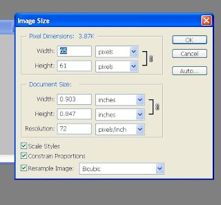
Open an image in Photoshop. Go to the Image menu and select Image Size. This is where you can change an image’s resolution and print size (width and height). The following Image Size dialog box will appear:

Note that the width and the height of the image as you view it on your monitor is not necessarily representative of the image’s actual width and height — the size it would print out at (Print Size). Average monitor resolution is 72 dpi. If you view a 72 ppi image at 100% in Photoshop, chances are that it will appear on your screen in its actual print size. However, this is not true when viewing a 300 ppi image. A 300 ppi image viewed on-screen at 100% will be enormous. Don’t get tricked into believing that what you see on your monitor is what you’ll get when you print or place the image into another application. The only way to determine what your image’s actual print size will be is through the Image Size dialog box.

When the Resample Image box is checked, any changes you make to an image’s width or height will not change the image’s resolution, and as such, any changes you make to an image’s resolution will not affect the image’s width and height. Keep in mind, however, when you increase width and height, or resolution, you are adding pixels to your image. These pixels don’t actually exist so Photoshop must create them. As such, you will succeed only in degrading the quality of your image.

If you want to increase an image’s width and height, or resolution, then uncheck the Resample Image box. Now any changes you make to the image’s width and height will change the image’s resolution, and vice versa:

  • If you decrease resolution, the width and height will increase
  • If you increase resolution, the width and height will decrease
  • If you increase the width or height, the resolution will decrease
  • If you decrease the width or height, the resolution will increase

The best way to increase the width and height of a scanned image is to scan the image in at a high resolution (about twice what your final resolution should be), and with the Resample Image box unchecked, decrease the resolution or increase the width and height—both will yield similar results. Once the image width and height is where you want it, you can then check the Resample Image box and type in the resolution you want. At this point, as long as you don’t increase resolution, or width and height, your image quality will not suffer.

“Cheap” Is Not A Dirty Word

Once upon a time the word “cheap” was pretty much scoffed at and thought to be taboo- but it appears that this previously taboo word may have a bit more clout in today’s economy. According to an article published on iMedia by Tom Crandall,  CEO of Ayohwahr Interactive,  “cheap” is no longer a dirty word and he appears to be right. Where companies once felt that this word would reflect upon them badly, they are quickly coming to realize that “cheap” attracts customers.  Craig Mcdonald, in his recent post, asked, “How much is the word “cheap airfare” worth in the United States? The answer is about $8 million, according to comScore Marketer Search Data, December 2007.

To Quote Tom Crandall:

“According to the Google AdWords Keyword Tool, the average monthly search volume for the phrase “cheap insurance” typically amounts to 673,000 queries. Last month, the number of queries for this term rocketed to 2.7 million. Likewise, the average monthly search volume for the phrase “cheap car” is traditionally about 1 million queries. Last month, the volume exceeded 3.3 million.

So, as you consider incorporating adjectives such as “affordable,” “budget,” “inexpensive,” “low-cost,” and “thrifty” into your SEO strategies, consider this: There is a growing number of brands weaving the keyword “cheap” into their on-page SEO elements. (Many are even incorporating this term into their marketing copy!)”

Obviously this bad word has been given a reprieve and marketers are learning that it does not damage brand perception or curb profitability. So, I can hear you thinking…. how in the world does this apply to signs? Well, the name says it all 🙂 We are cheap and we are not afraid to tell the whole world!

What about you?

Vector vs Bitmap

Vector-vs-bitmap

Table of Contents

In the realm of digital design, especially when crafting visually compelling signs with images or logos, the choice between vector and bitmap (or raster) graphics is crucial. These two foundational types of 2D graphics serve distinct purposes and are essential tools in a designer’s arsenal.

Bitmap (Raster) Graphics: Pixel-Perfect Detail

Bitmap graphics are digital images composed of a matrix of pixels, where each pixel holds data for its specific color. This pixel-based structure means bitmap images have a set resolution and lose clarity when scaled beyond their original size. Commonly encountered bitmap formats include JPEG, PNG, GIF, and TIFF, each with its own use-case scenarios, from web images to high-quality print documents.

  • Key Traits of Bitmap Images:
    • Pixel-based composition
    • Fixed resolution, making resizing a challenge without quality loss
    • Versatile in usage, but restricted to rectangular shapes
    • Limited transparency support, depending on the format

Bitmap images are ideal for detailed, complex imagery like photographs, where capturing nuance is key. However, their dependency on resolution and difficulty in resizing without quality degradation can be limiting in dynamic design scenarios.

Vector Graphics: Scalability Meets Precision

Vector graphics, in contrast, are not defined by pixels but by paths based on mathematical equations. These paths outline shapes, colors, and fills, making vectors infinitely scalable without any loss of quality. This resolution independence of vector graphics makes them perfect for logos and sign designs that need to maintain sharpness across various sizes and mediums.

  • Key Traits of Vector Images:
    • Comprised of scalable objects, allowing for flexibility in design
    • Resolution independent, ensuring clarity at any size
    • Ideal for bold, graphic illustrations, logos, and text
    • Supports transparent backgrounds for versatile overlay applications

Common vector formats include AI (Adobe Illustrator), SVG (Scalable Vector Graphics), and EPS (Encapsulated PostScript), among others. These formats are favored for their adaptability and precision, especially in branding and marketing materials where visual impact is paramount.

Choosing Between Bitmap and Vector

The choice between bitmap and vector graphics depends on the project’s needs. Bitmaps are unbeatable for intricate, photo-realistic images, while vectors offer unmatched scalability and simplicity for graphic designs. Understanding the strengths and limitations of each can significantly impact the effectiveness of your visual communication.

For detailed guidance on file formats supported and how to best prepare your designs for production, exploring further resources or consulting with design professionals is recommended. Embracing the right graphic type not only ensures your designs are visually stunning but also optimizes your workflow for efficiency and impact.

How To Create A Great Outdoor Sign

Before you design your sign, be sure to consider the intended display area for your signs. Many graphic artists make the mistake of creating designs that look fabulous on their screen but not so fabulous for a large display sign. Whereas text conveys the message in an electric file, graphic design conveys the message in a large printed product such as banners and cortex Bandit signs. This is why it is so important to have minimal written content.

With all the competition available in today’s world, it’s important to best utilize the sign colors and space to produce the best possible advantage. The right text will give the most import information needed, such as contact information. But it is the colors, the layout and the design which will grab new customers.

To maximize the impact of your signs, be sure to take into consideration where you want to place your signs. The placement of your signs plays a big role in how many new customers you gain.

Here are some quick tips prior to placing your Super Cheap Signs order.

  1. View a couple of the areas or the location you will be placing your signs. Guess work can create a lot of wasted space. Outdoor signs are designed for pedestrians and motorists, the signs are expected to be more visible from farther distances than indoor signs. If most the new customers you want to attract will see them at night, you don’t want a black background with yellow letters.
  2. Vinyl banners are primarily used for its visual impact more than its word content. The visual display should be able say its message in seconds with a picture and minimal text. Use contrasting colors so the words and or pictures stand out. The colors you use in your banner should not match the color of the building or placement to which you will be using to hang the banner from.
  3. Consider who will be reading the sign and who you want to read the sign. If you own a coffee shop and the community is dog friendly, your banner can show a dog sitting at a table while its owner drinks coffee.

Placing Bandit Signs – Against the Law?

Attached is an impassioned email from a loyal customer in the DC area. It’s about some of the laws that have been passed regarding the placement of so-called ‘Bandit Signs’, or Yard Signs, and their response. This customer game me permission to post the email, on the condition I leave out the author’s name. It’s a bit long, but for those of you interested in the topic its still a very good read.

You’ll also see there is a letter attached from a Real Estate Investor to the ACLU…

Happy Reading!

-Jon

Dear Jon:
I have been advised by my attorneys to simply change the phone number on the sign to an unpublished number. We rotate the phone numbers and we don’t list our company name in my home state, VA. I made it difficult for them to fine us ($100 a sign in VA, $500 a sign in MD). I changed our business over to an LLC from a sole proprietorship. Now, the registered agent for the company resides in 100 miles from the jurisdiction where we put the signs.
We never put the signs out during the day. We start putting them out after 5:00 p.m.
This makes it impossible for the Virginia, Maryland, and DC department’s of transportation to fine us since they don’t work after 5. They are the ones who have the jurisdiction to fine us (they can only fine us if they see someone named in our company’s LLC put a sign in the ground). We also purchased this device that puts the signs high up on poles. Those signs stay up for a week or more. We also use two sided tape to tape them to the metal sign poles in the medians.
Our lawyer told us to politely point out to a cop-should they harass us-that putting signs out is not a criminal violation. We are told to say to all cops, “Do you have jurisdiction over this matter? Is this a criminal violation? My lawyer told us it wasn’t. Have a good day officer.”
My arrangement sounds sleazy at first glance, but I have had several lawyers look at our local sign ordinances. They have told me that they are a blatant violation of our commercial free speech. I figure it would cost me around a half a million dollars to fight the local ordinances. It’s a lot simpler to play dirty like the Realtors and politicians. Also, if I did fight the sign ordinances in our area, there’s a good chance they might actually write a proper sign ordinance (no signs for anyone anywhere in this jurisdiction). Protecting free speech is my second priority. Making a living is my first.
The lazy government worker who picks up one of our advertising campaign signs can’t fine us because the phone number on the sign is simply not listed when they do a reverse search. It would cost them much more than what they would make fines to get a court order to find out who we are. They just don’t bother. The local powers that be do, however, call us up every so often to tell us that, “They are going to do a sting on us.” Well, they did. I thanked them for letting me know as well. They tried to do it by having a well marked county vehicle follow me around one day. To make a long story short, I stopped my car after a few miles of him tailing me, waved a sign at them and smiled. Then I walked into a Mac Donald’s, sat down at a table by the window and stared at them parked in the middle of the road staring at me. (Legally, they couldn’t do anything because they didn’t see me put the sign in the ground). Anyway, I exchanged my car for a rental for the next few weeks, started putting the signs out at night and I haven’t seen them or heard from them since.
The bottom line. Many jurisdictions around the country are being sued by bigger businesses with bigger budgets and they are winning. A sign ordinance with an exception for one group or another violates several supreme court decisions as outlined in the attached documents. There’s a lot more bullshit we have encountered over the ordinances, but I think we have a handle on it now.
Suing the government is extremely expensive. Check out your local chapter of the ACLU. The Thomas Jefferson Center also agreed to do all of the legal research for us for free in conjunction with our lawyer should we ever decide to go to court. Our lawyers have told us that a lawsuit against the government requires endless billable hours of research. There are hundreds of law clinics that could aid in that research for free.
There’s a lot more to all of this than I mentioned in this email. Google Reid Cox and read his Constitutional Primer On Sign Ordinances. I also attached a letter-PDF-that I gave to the Director of the Virginia chapter of the ACLU.

Real Estate: Moving In The Right Direction

Curiosity works – think about Alice in Wonderland when Alice followed the rabbit down the hole? There’s a simple way to drive a lot of curious buyers to your property. Directional signs can be a great marketing tactic for real estate investors because they can create curiosity among people who are already looking for a house in the neighborhood of your property.

Directional signs are usually simple plastic yard signs with arrows on them that direct people toward an end point – usually an open house, new development, etc. For real estate investors a few well-placed signs can bring potential customers right to their doorstep. Arrow signs eliminate the need for memorizing phone numbers, getting directions, etc., and breaks your call to action down into the simplest terms – follow me.

Creating and placing Directional Signs

Sign content should describe the kind of property you are advertising and the address underneath in big, bold letters to catch the buyer’s attention, and (of course) arrows. Placement strategy for directional signs is pretty easy, as long as you do your homework on the neighborhood. Start by driving around and figuring out the best routes to get from Point A (busy intersections) to Point B (the property). Street corners should be key spots for your signs as they dictate where to turn. You may not need signs on a long stretch road, but it may be a good idea to place one there anyway to let your potential buyers know that they’re on the right track and to avoid any confusion. Signs can be placed at the corner of someone’s property as long as you ask for their permission first. Most people will agree to the sign if you agree not to disturb anything on their lawn such as sprinkler systems or anything else on their yard. It would also be nice to toss in a gift card for their troubles, if it is within your budget.

Directional arrow signs are inexpensive, no-hassle on your time, and easy to implement and manage. There you have it, an effective marketing tool that will drive people from their cars straight to your front door.

Sign Design Tool

What do you want to see in a ‘Sign Design Tool’ on our website? I know what WE want, but that may not be what the customer wants! Many of you have suggested adding a this kind of feature. Other printing and sign companies have created things that are good, some very good. But there is always better.  What do you think?